

Aggregator
The Aggregator is your reporting tool. It collects data across all modules (persons, roles, value streams, relationships …), filters it by your criteria, computes metrics and renders the result as a chart or table. Reports can run once or on a schedule.
Open it from the sidebar under Settings → System & Automation → Aggregator (/aggregator). The
page is only visible to tenant admins and platform admins.
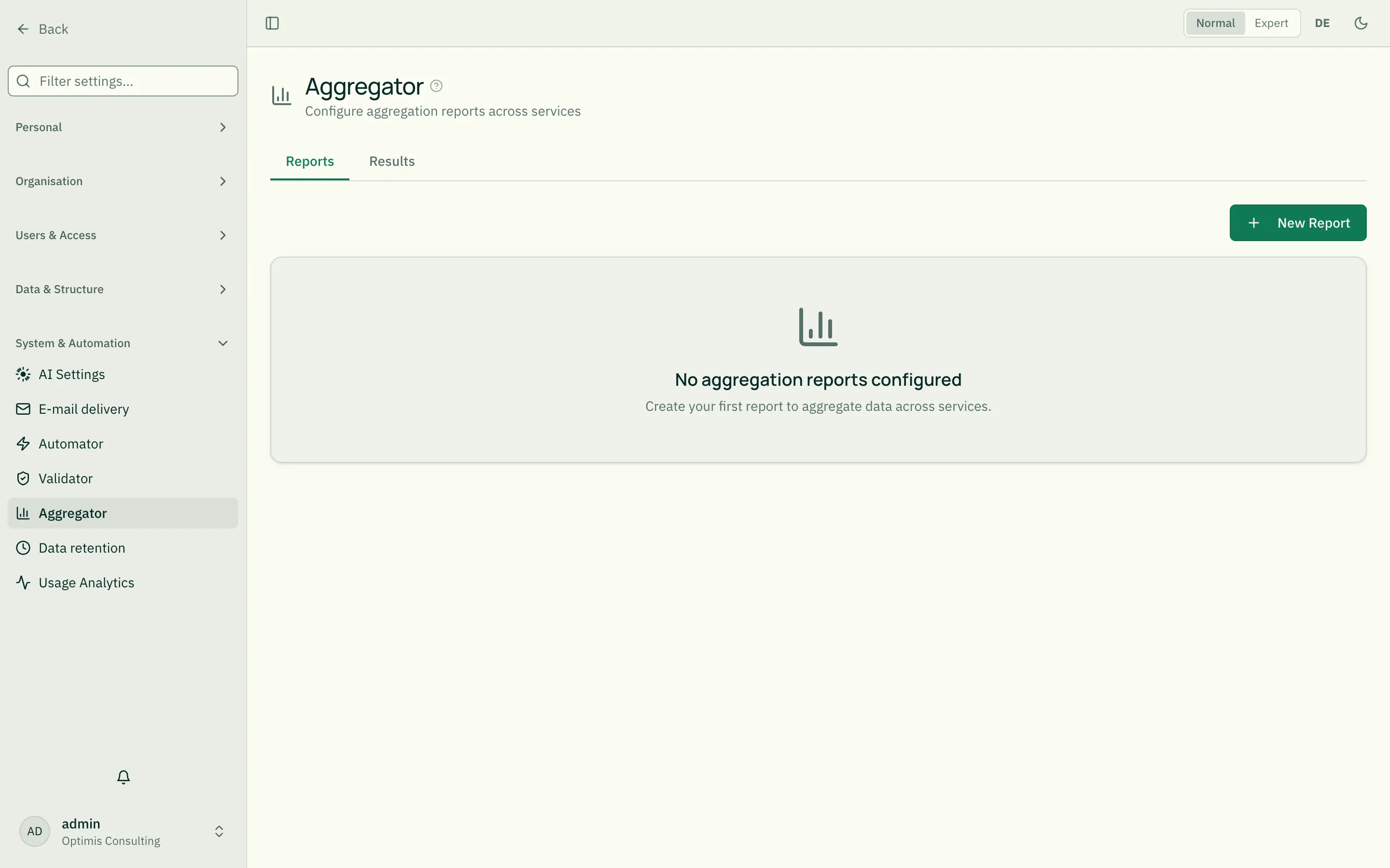
The two tabs
Section titled “The two tabs”- Reports — create, edit, run and (de)activate reports.
- Results — the last computed result per report as a chart/table.
Building a report (5-step wizard)
Section titled “Building a report (5-step wizard)”New Report opens a five-step wizard. Navigate with Next/Back and save at the end.
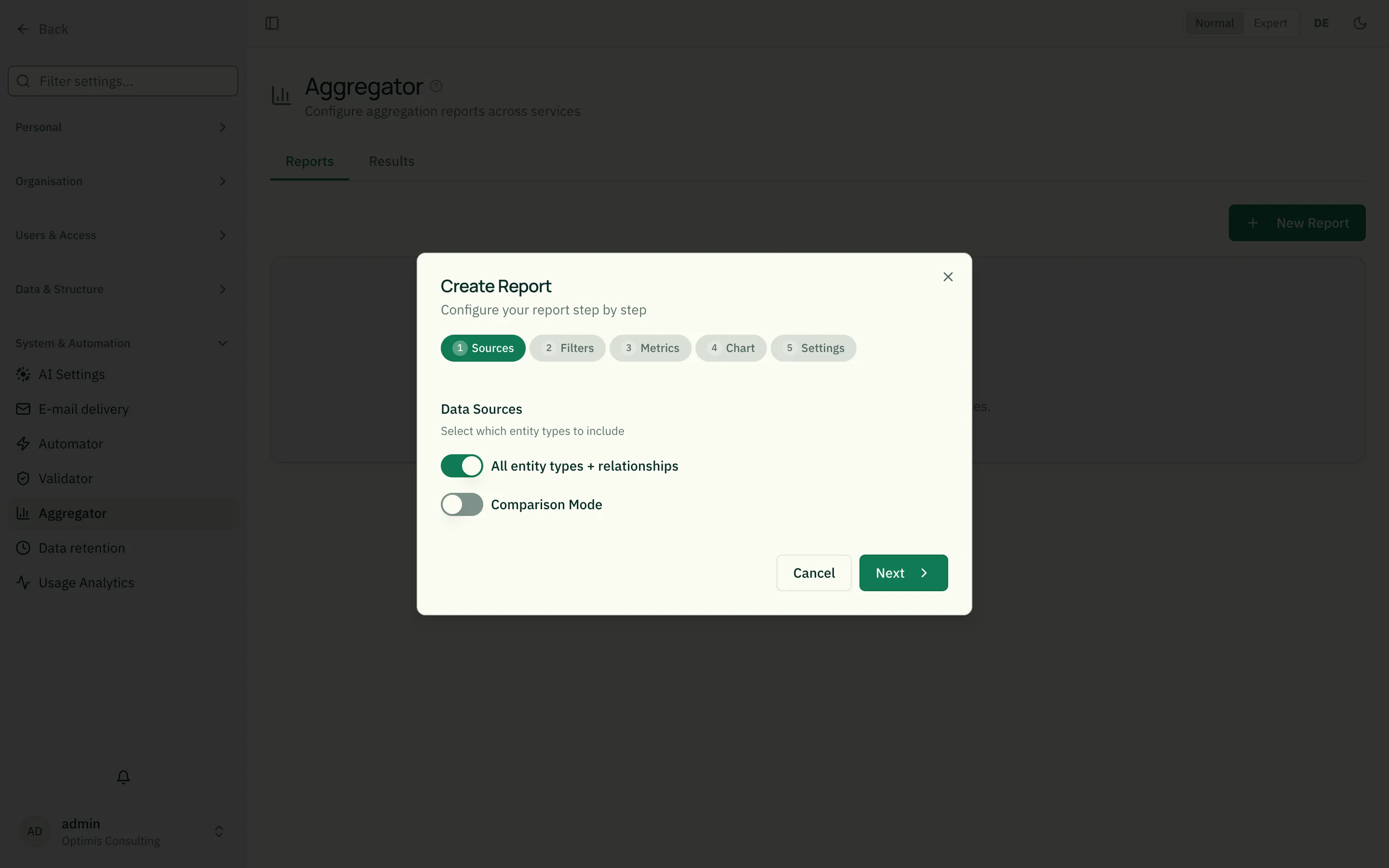
Step 1 — Data sources
Section titled “Step 1 — Data sources”Choose which modules feed the report. Multiple selection is possible. Two special sources:
*— all modules._relationship— the relationships themselves (instead of entities).
Working example: the “Nexora Software” demo tenant has a report called “Beziehungsübersicht” (Relationship overview) that uses
_relationshipas its data source and groups by_relTypeName(relationship type) — a good template for building your own relationship reports.
Step 2 — Filters
Section titled “Step 2 — Filters”Filters narrow down which records are counted. Each filter has a field path, an operator and a value.
- Field path: e.g.
name,descJsonb.statusor a technical field like_module,_entityType. Available fields are auto-discovered from the chosen modules. - Operator — what the filter options mean:
| Operator | Meaning |
|---|---|
eq / neq | equal / not equal |
gt / gte | greater / greater-or-equal |
lt / lte | less / less-or-equal |
contains / notContains | contains / does not contain |
startsWith / endsWith | starts with / ends with |
exists / notExists | field present / absent |
in / notIn | in list / not in list |
- Value: a fixed value — or a context variable replaced at runtime:
| Variable | Means |
|---|---|
$currentUser, $currentUsername | logged-in user |
$currentPerson | their person entity |
$currentTenant | current tenant |
$today, $now | today’s date / timestamp |
$thisWeek, $thisMonth, $thisYear | start of week/month/year |
Context variables make reports personalized — e.g. “my open projects” with
$currentPerson, which fits every viewer.
Multiple filter groups (OR grouping)
Section titled “Multiple filter groups (OR grouping)”By default all filters are AND-combined — a record must match every filter. “Add OR group” creates a second group: records count if they fully satisfy either group (filters within a group stay AND-combined). With just one group the builder looks exactly as before — grouping is purely optional and only becomes visible once you add a second group.
Example: “People in Engineering or Sales, each with status Active” →
group 1: descJsonb.department eq Engineering AND status eq Active; group
2: descJsonb.department eq Sales AND status eq Active.
In Expert mode (the toggle in the top-right, or M) an additional “Edit as JSON” option is available — for filters that also need NOT or deeper nesting the group form can’t express. See Automator’s “Advanced Mode” section for the JSON format — it’s identical.
Step 3 — Metrics & grouping
Section titled “Step 3 — Metrics & grouping”- Metric: what is computed. A metric has a field and an aggregation:
| Aggregation | Meaning |
|---|---|
count | number of records (field *) |
countDistinct | number of distinct values |
sum | sum |
avg | average |
min / max | smallest / largest value |
- Group by: a field that summarizes the results — e.g.
_module(count per module) ordescJsonb.department(count per department).
Step 4 — Visualization
Section titled “Step 4 — Visualization”Choose the chart type and map the axes to fields/metrics. Available types: bar, line, pie, scatter, radar, treemap, heatmap, KPI (single metric) and table.
Each chart type has required axes (e.g. bar needs X + Y). If a mapping is missing, the wizard points it out before saving.
Step 5 — Schedule
Section titled “Step 5 — Schedule”- Interval:
none(manual only) or automatically every5min,15min,30min,hourly,daily,weekly. - Timeout: max runtime in seconds (default 600), so a heavy report does not run forever.
Running reports & reading results
Section titled “Running reports & reading results”In the report list you start a report via Run. The result is cached (snapshot) and shown in the Results tab — even without recomputing.
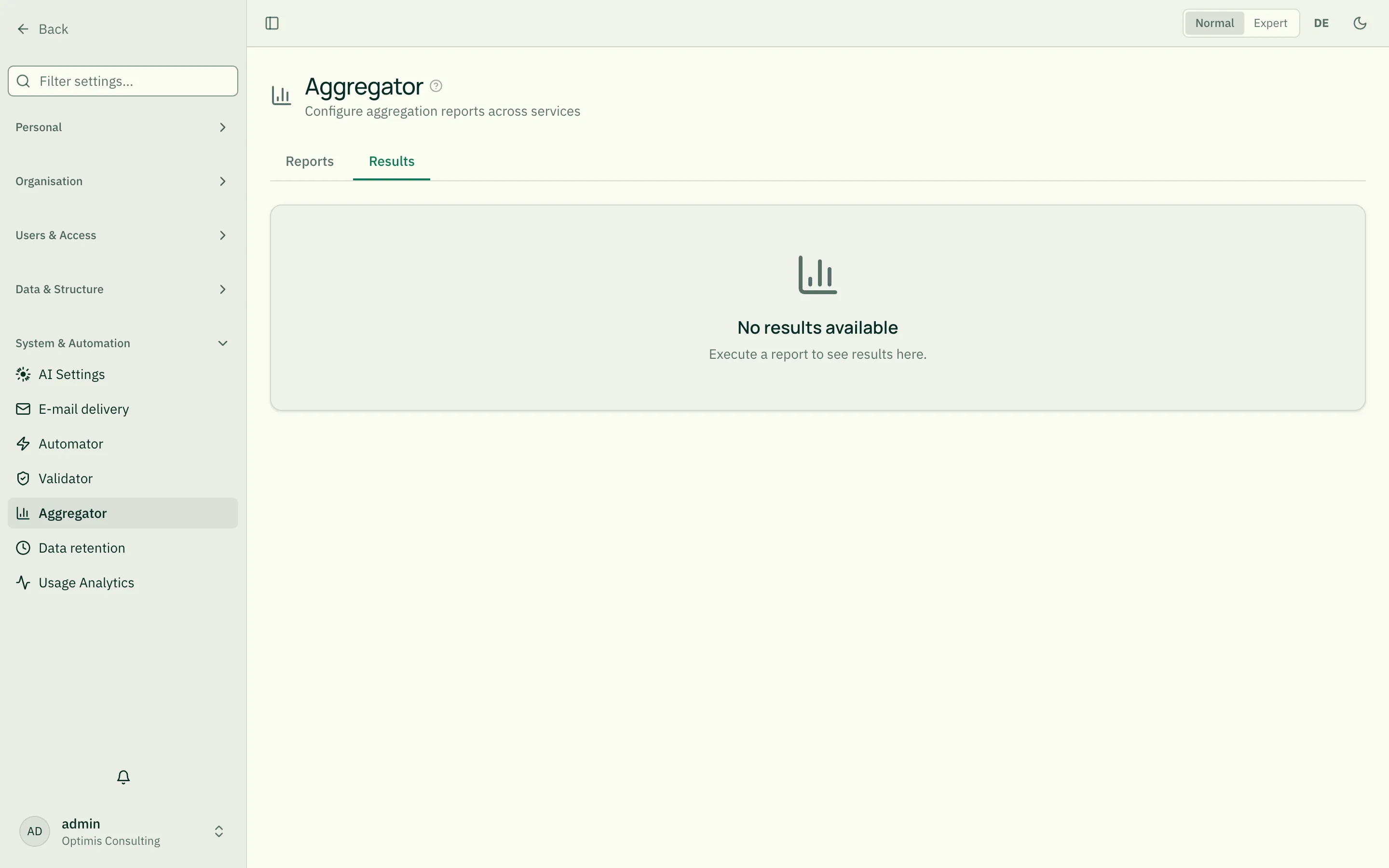
Scheduled reports run automatically in the background; the result is updated on every run.
Who sees which reports?
Section titled “Who sees which reports?”- Tenant admins (and platform admins) see all reports of the tenant.
- Regular users only see their personal reports.
Maintenance tips
Section titled “Maintenance tips”- Start small: begin with data source
*, metriccount, group by_module— that instantly yields a meaningful overview. - Fields only after picking modules: the field list in filters/metrics fills from the chosen modules. So pick data sources first.
- Use schedules sparingly: frequent intervals (
5min) create load.dailyis enough for most analyses. - Test context variables: personalized reports show from your own perspective — another user may see something different.
- More templates in the demo tenant: “OKR-Fortschritt” (data source
okr, filtersubtype eq key_result, metricavg(progress), grouped byowner), “Org-Kennzahlen” (data sourceorganigramm, filterorgType eq Team, metricsum(headcount), grouped bydivision) and “Risiko-Kennzahlen” (data sourcerisk, metricsavg(riskScore)+count, grouped byriskCategory) show typical filter+groupBy+aggregation combinations.
Related
Section titled “Related”- Automator — automatically creates the data you analyze here
- Validator — safeguards the data quality reports build on
- Understanding Relationships — the basis of the
_relationshipsource - Entity Types — where modules and fields come from