

JSON Schema for Entity Types
Every entity type carries a JSON Schema in descJsonb. The editor
automatically builds the create/edit draft form from this schema.
The schema controls three layers:
- Structure — which fields exist (standard JSON Schema)
- Form behavior — how fields render in the edit form (standard + project-specific extensions)
- Display — how values are rendered in normal mode
(
x-presentation, see Normal & Expert Mode)
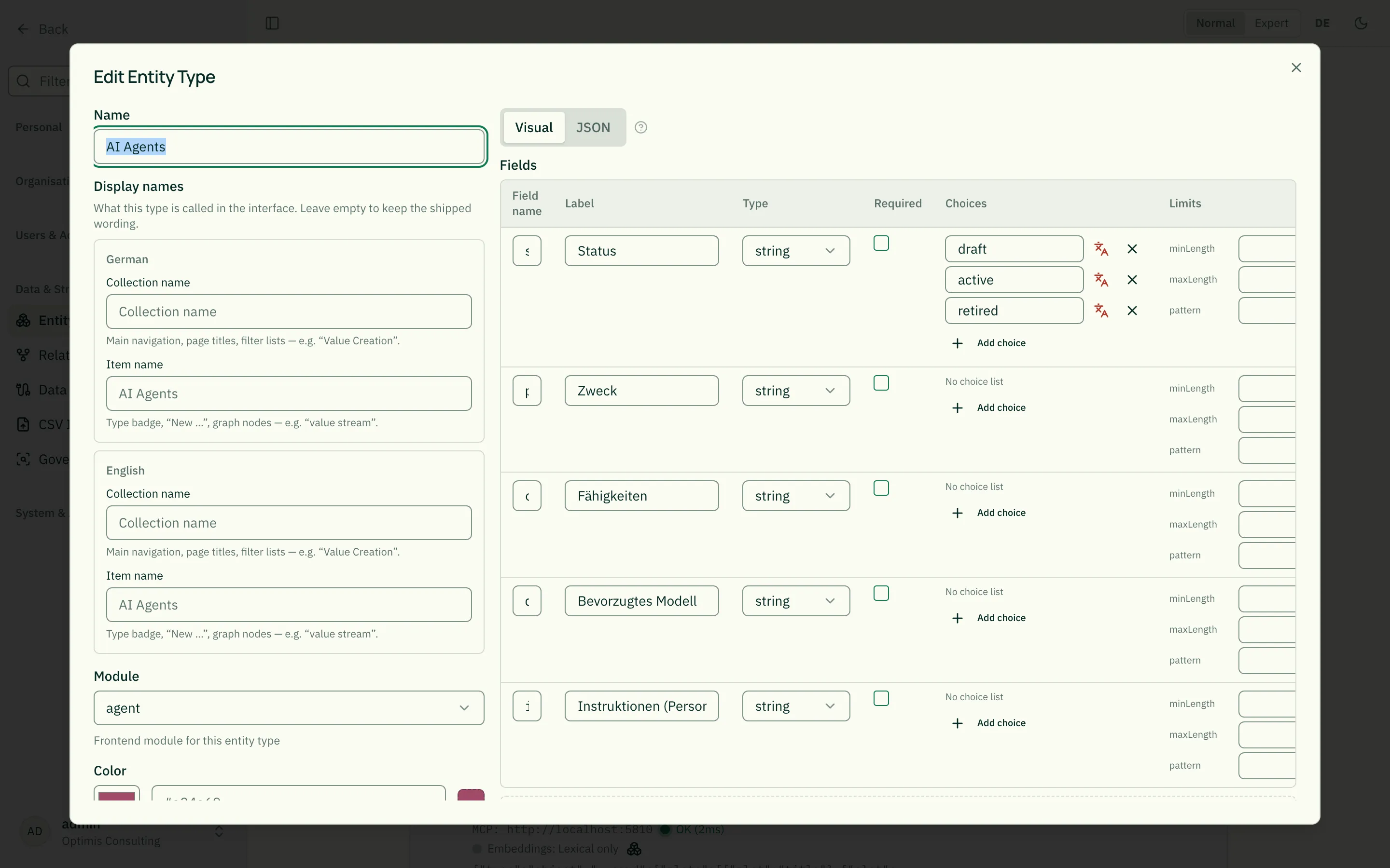
Two ways: “Visual” or “JSON”
Section titled “Two ways: “Visual” or “JSON””The create/edit dialog for an entity type has two tabs.
Visual (the default) shows a table of all fields. You add fields with a button, set field name and label, pick the type from a list, tick the required box, and maintain a field’s list of choices — without writing a line of JSON. Below it sit the familiar editors for display, node colour and node texture; all of them work on the same schema.
JSON still shows the raw schema in a text editor. Both tabs share the same
state: what you change visually appears in the JSON immediately, and vice versa.
For anything the visual tab cannot (yet) do — showWhen, nested objects,
format keywords — the JSON tab remains the way.
When you rename or delete a field, the visual tab carries the dependent
places along: the required array and the driver fields of
x-node-color/x-node-texture. Remove a choice and its colour and texture
mappings go with it — otherwise the server rejects the save with an error.
Careful with existing data: renaming or deleting a field only changes the schema. For records already stored, the migration dialog opens afterwards and lets you decide which old field maps onto which new one. Relationship types do not have that dialog yet — there, values of a renamed attribute are lost.
Relationship types have the same visual tab for their attributes. The bilingual meaning and the participant configuration stay untouched — the builder only sees the schema part.
Skeleton
Section titled “Skeleton”A schema always has type: "object" at the root, a properties map,
and optionally a required array:
{ "type": "object", "properties": { "description": { "type": "string", "title": "Description" } }, "required": ["description"]}Field types
Section titled “Field types”type | Renderer in edit form |
|---|---|
"string" | Text input with @-mention autocomplete (default) |
"number" / "integer" | Number input |
"boolean" | Checkbox |
"array" | List editor with add/remove buttons (requires items) |
"object" | Nested sub-form with its own properties |
Label, description, default
Section titled “Label, description, default”titlesets the label. Withouttitlethe editor shows the property name.descriptionappears as help text below the field.defaultpre-fills the value in create drafts.
{ "type": "object", "properties": { "priority": { "type": "string", "title": "Priority", "description": "Controls the order in list views.", "default": "normal" } }}Required fields
Section titled “Required fields”The easiest way to mark a field as required is the Required column
in the “Visual” tab. In JSON it is an array at the root level — not
on the property itself. Common mistake: putting "required": true on
the property does not work.
{ "type": "object", "properties": { "name": { "type": "string" }, "description": { "type": "string" } }, "required": ["name"]}“Required” means filled in, not merely “the field exists”: an empty
text box, one containing only spaces, and an empty list all count as
missing. A 0 and an unchecked box, by contrast, are decisions someone
made and count as filled in.
Where it applies: the form shows missing required fields and blocks publishing — saving as a draft stays possible so unfinished work can be parked. On publish the server checks as well, which also covers paths that never touch the form: connectors, the automator, the assistant and the CSV import. The import creates drafts, so missing required fields appear there as a warning rather than an error.
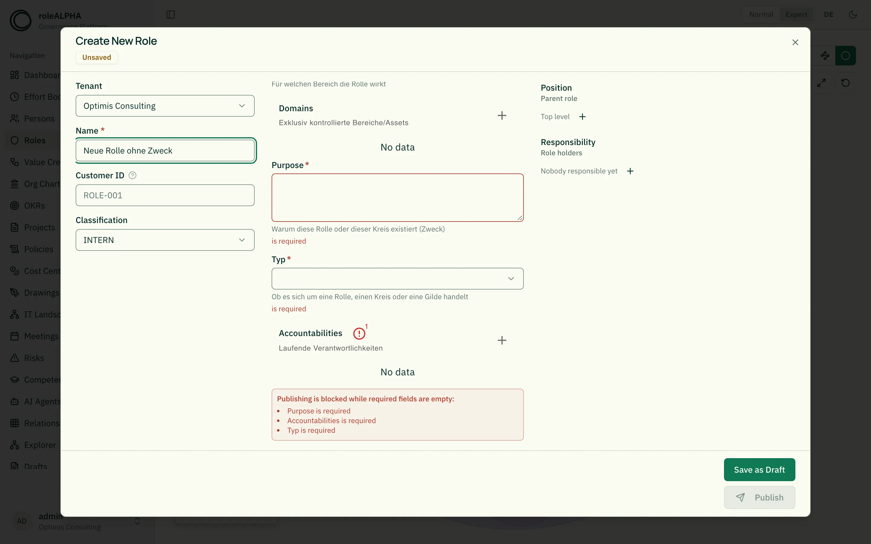
A hidden field is never required. If a required field carries a
condition (showWhen, see below) and that condition is not met, it is
not demanded — otherwise you would end up in a dead end: impossible to
fill in, yet required.
A required field has to exist. If required names a field that is
missing from properties (a typo, a renamed field), the editor rejects
the schema. Without that check, no record of this type could be
published afterwards — with a message only you as an admin can fix.
Required only under a condition
Section titled “Required only under a condition”To make a field required only in certain cases, use the JSON Schema
mechanisms if/then or dependencies in the “JSON” tab:
{ "type": "object", "properties": { "contractType": { "type": "string", "enum": ["internal", "external"] }, "supplier": { "type": "string" } }, "if": { "properties": { "contractType": { "const": "external" } } }, "then": { "required": ["supplier"] }}The field builder cannot produce this yet — but JSON you enter takes
effect immediately. To make the field also visible only in that case,
add a matching showWhen condition.
Dropdowns
Section titled “Dropdowns”enum automatically turns a string into a dropdown — the default
string renderer is bypassed, so @-mentions do not work in enum
fields.
{ "status": { "type": "string", "title": "Status", "enum": ["draft", "active", "archived"], "default": "draft" }}The subtype (subtype) — a reserved field name
Section titled “The subtype (subtype) — a reserved field name”Some modules distinguish several kinds within one entity type: role, circle and
guild for roles; company goal, objective and key result for OKRs; chain, value stream,
sub-stream and activity in value creation. This field has the same name in every
module: subtype (label “Subtype”).
- You maintain the values like any choice list: add, label, reorder.
- The field itself is locked (padlock icon in the visual editor): it can be neither renamed nor deleted and must remain a choice list of strings. Cards, textures and reports rely on it.
- Earlier names (
entityTypefor roles,okrTypefor OKRs,processLevelin value creation) are migrated automatically by roleALPHA — including all records and open drafts. Older states in the history and in backups remain readable. - If you had already created your own field named
subtype, your tenant is not migrated automatically; operations will sort this out with you.
A gate in value creation is not a subtype but an entity type of its own — it has its own fields and its own shape.
Date and special formats
Section titled “Date and special formats”format: "date"→ date picker instead of a plain inputformat: "time"→ time pickerformat: "date-time"→ date + timeformat: "email"→ email validationformat: "uri"→ link field: URL validation, an open button next to the input, and a missinghttps://added when you leave the field (see Linking documents)
{ "startDate": { "type": "string", "format": "date", "title": "Start date" }}Note: for the date picker to appear, the field must be of type
stringand carryformat: "date"(or"time"/"date-time"). If you pick one of the date presentations (date-relative/date-absolute) in the “Display per field” editor,format: "date"is set automatically — the editor then shows the date picker without touching the JSON.
Validation
Section titled “Validation”| Property | Effect |
|---|---|
minLength, maxLength | String length bounds |
pattern | Regex validation (e.g. "^[A-Z]{2,3}$") |
minimum, maximum | Number range |
multipleOf | Number step |
minItems, maxItems | Array length |
uniqueItems | Forbid duplicate array entries |
You set these limits in the “Visual” tab under Limits — each field
type offers exactly the keywords that actually take effect there (text:
length and pattern; number: range and step; array: item count). An
invalid regular expression is flagged as you type, and a rule that
contradicts itself (minimum greater than maximum) cannot be saved at
all.
Where the limits bite: while filling the form, a violation is shown on the field and publishing is blocked; saving as a draft stays possible so unfinished work can be parked. On publish the server checks as well — a violation is rejected there too, even if it arrives by some route other than the form.
Until August 2026 these limits were effectively decoration: the editor showed the error but saving went through anyway, and no server-side check existed. When you add limits to a type whose data has been around for a while, first run the report
scripts/report-schema-violations.tsto see how many records the new rule would reject.
Required fields (required) apply in the same way — see above.
Until August 2026 they were excluded and left to the
validator; since then the rule is: whatever JSON Schema
can say about a single record lives in the schema, and the validator
carries what goes beyond that — rules about relationships.
Multi-line input (textarea)
Section titled “Multi-line input (textarea)”"multi": true on a string field → the editor renders a textarea
instead of a single-line input. @-mention autocomplete keeps working.
{ "description": { "type": "string", "title": "Description", "multi": true }}multi is a project-specific extension. The uiSchema generator
translates it to JsonForms options (options.multi).
Choice lists and their labels (x-enum-labels)
Section titled “Choice lists and their labels (x-enum-labels)”An enum entry is the stored value, not the display text. That is not a
formality: node colours and textures, the conditions from the previous section
and the validator service’s rules all match on exactly this value. It must
therefore not change just because someone switches the interface language.
The label is a separate layer next to it:
"orgType": { "type": "string", "enum": ["company", "department"], "x-enum-labels": { "company": { "de": "Unternehmen", "en": "Company" }, "department": { "de": "Abteilung", "en": "Department" } }}The raw value must be English and machine-readable (lower case, digits, underscore). The “Visual” tab offers a translation button per choice; German and English are both required. If one is missing the editor flags it and the server rejects the save — otherwise a user with that language setting would see the technical raw value.
Where the label shows up: in the select while filling the form, as a badge on the detail page, and as a group heading in the cluster views. Where it does not: anywhere a comparison happens — there only the raw value counts.
Changeover in August 2026: the built-in choice lists used to carry German plain text as their value (
"In Überprüfung","Unternehmen"). They were moved to English raw values; the German wording is now a label. Existing tenants are handled by a dedicated migration script (scripts/migrate-default-enums.ts) that rewrites schema, colour mappings, conditions, records and open drafts together. A dry run is the default.
Conditional fields
Section titled “Conditional fields”showWhen shows a field only when another field has a specific value.
Useful for “other reason…” inputs or mode-dependent fields.
{ "type": "object", "properties": { "status": { "type": "string", "enum": ["active", "blocked", "other"] }, "blockReason": { "type": "string", "title": "Reason for blocking", "multi": true, "showWhen": { "field": "status", "values": ["blocked", "other"] } } }}showWhen is a project-specific extension and is translated into a
JsonForms rule with effect: "SHOW".
The condition applies everywhere, not just in the form: whatever showWhen
hides is also left out of the detail view, the change preview of a draft and the
card in the explorer. An existing value is not deleted — if an entity switches
back to its earlier subtype, it is there again. Only the expert view still shows
all raw data, so a hidden leftover value stays findable. And a hidden field is
never required.
In the “Visual” tab every field row has a “Visible when” column: pick the
driving field and mark the values that should reveal the field. Only fields with
a fixed set of choices (enum) or yes/no fields are offered — with a free-text
field the condition would practically never hold, and there would be no values
to mark.
Two things are handled for you, because they otherwise go wrong silently:
- Rename the driving field and the condition follows. Delete it, or take away its choices, and the condition disappears — the dependent field becomes always visible again. That is the safer direction: a condition nobody can satisfy would remove the field from the form permanently, without any error.
- On save the system checks that the driving field exists, has a fixed set of choices, and can actually take the listed values. An impossible condition is rejected rather than stored.
Arrays and nested objects
Section titled “Arrays and nested objects”Lists need an items schema. Nested objects have their own
properties.
{ "tags": { "type": "array", "title": "Tags", "items": { "type": "string" }, "uniqueItems": true }, "contact": { "type": "object", "title": "Contact", "properties": { "email": { "type": "string", "format": "email" }, "phone": { "type": "string" } } }}@-Mentions in text fields
Section titled “@-Mentions in text fields”Every plain string field automatically gets @-mention search. Type
@ in a text field to reference another entity. The mention is
stored as @[Name](entity:UUID) and rendered as a clickable link on
display. See @-Mentions for details.
Mentions are disabled on:
- fields with
enum(dropdown) - fields with
format: "date"(date picker)
Display in normal mode (x-presentation)
Section titled “Display in normal mode (x-presentation)”In normal mode a dedicated renderer displays values according to their type and an optional presentation choice. See Normal & Expert Mode.
x-presentation | Effect |
|---|---|
"long-text" | Multi-line with line-clamp + “more” toggle |
"markdown" | Markdown rendering |
"badge" | Badge instead of plain text |
"date-relative" | “5 minutes ago” |
"date-absolute" | “2026-05-27” |
"email", "url" | Clickable link |
"boolean-icon" | Check / X icon |
"currency" + x-presentation-config.currency | Currency format |
"progress" + x-presentation-config.max | Progress bar |
"bullet-list" | Bullet list from array — default for every array |
"chip-list" | Chips from array |
"link-list" | Link list from an array of bare URLs |
"document-links" | Document list from an array of {label, url} — file-type icon, label, preview, see Linking documents |
"image" | Image (upload in the form) |
"icon" | Icon (picker in the form) |
"hidden" | Hidden in normal mode |
A field of type array is an enumeration and is therefore rendered as a
bullet list in normal mode without any configuration — one line per entry,
just like in expert mode. If you prefer chips or a link list, pick them
explicitly.
You don’t set these in the raw JSON — use the UI editor “Presentation per field” right below the JSON editor.
The two date presentations (date-relative, date-absolute) affect more
than the normal-mode display: selecting one also sets format: "date" on
the field so that a date picker appears in edit mode. Switching back to a
non-date presentation removes that automatically added format: "date".
The same applies to links: picking the URL presentation sets
format: "uri" — that gives you the link field with an open button in edit
mode, and the value is validated on CSV import. For link list the format
goes onto items, because there the entries carry the URLs. Links are
clickable in both view modes. Details in Linking documents.
Icon fields (x-presentation: "icon")
Section titled “Icon fields (x-presentation: "icon")”Sometimes it isn’t the entity type that should carry an icon but the
individual entity — e.g. a symbol per department or per risk category.
Add an ordinary string field and pick the Icon presentation in the
“Presentation per field” editor:
"symbol": { "type": "string", "title": "Symbol", "x-presentation": "icon"}Effect:
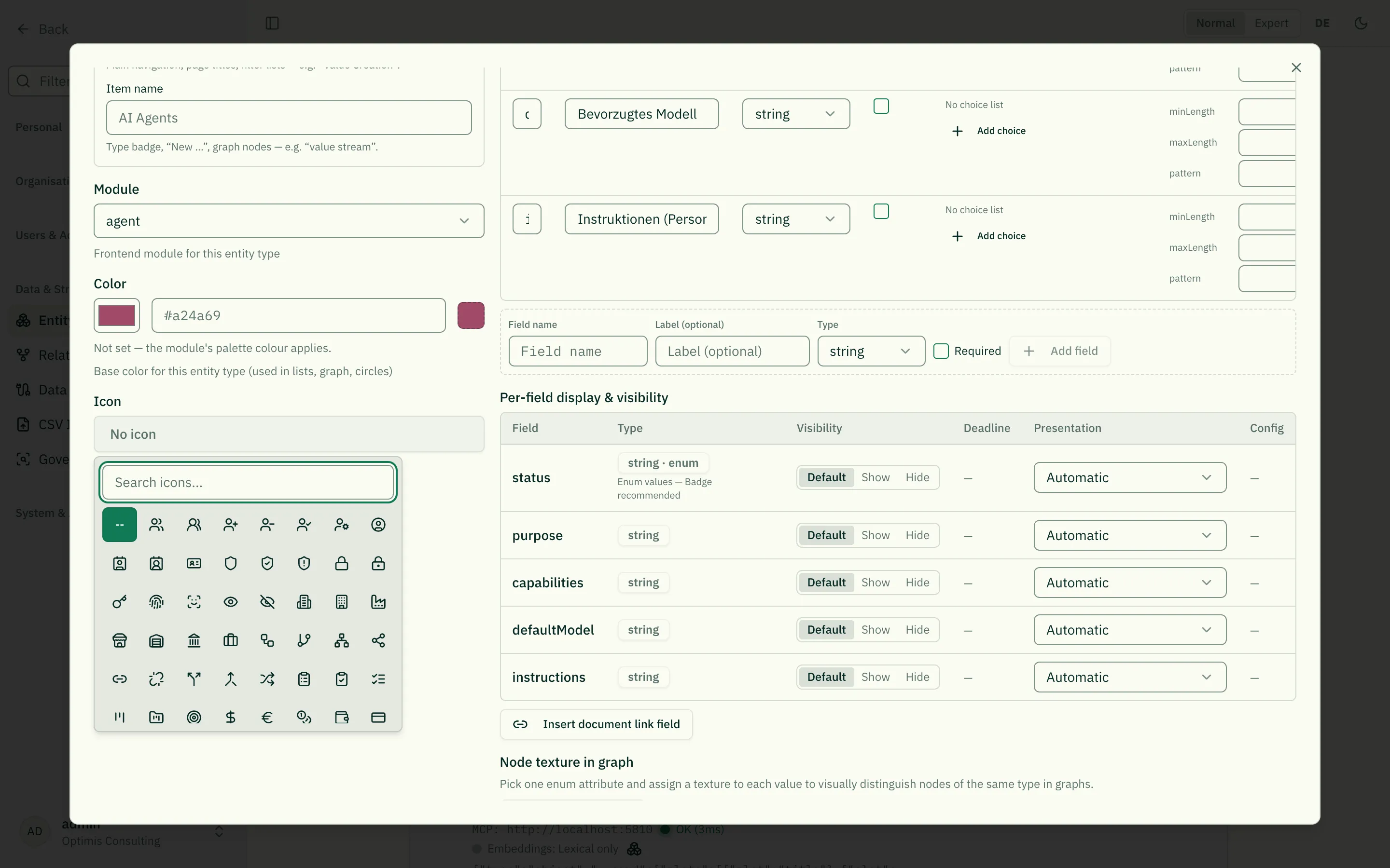
-
In the form a searchable icon picker replaces the text field — the same list you already use for the entity type’s own icon. Nobody has to type icon names.
-
In normal mode the icon and its name are shown instead of the raw reference.
-
In the list and cluster views each entry carries its entity’s own icon instead of the type icon shared by every row. Without a value it falls back to the type icon. If a type has several icon fields, these views use the first one in the schema — the others stay ordinary fields on the detail page.
The stored value is an icon reference of the form lucide:<Name>, e.g.
lucide:Shield. The prefix names the icon source; today there is exactly one
(the bundled icon set), more can be added later without touching existing
values. References without a prefix (Shield) remain valid and are read
as icons of the bundled set.
If a stored icon is unknown (e.g. because it came from a backup of a newer version), the detail page shows the reference as plain text — the value is never lost.
Colour fields (x-presentation: "color")
Section titled “Colour fields (x-presentation: "color")”When a single entity should carry its own colour — a marker colour per team
or per category, say — add a plain string field and pick the Colour
presentation:
"tint": { "type": "string", "title": "Marker colour", "x-presentation": "color"}Effect:
- In the form a real colour picker appears, with preview swatch and hex
input. Nobody has to type a colour code like
#3B82F6by hand. - In normal mode the swatch is shown next to the hex code.
The stored value is the hex string — no separate format. A value that is not a hex code (from an import, say) is shown as plain text rather than as an empty swatch; the value is never lost.
Not to be confused with
x-node-colorbelow: there the colour is derived (from an enum value, for graph nodes); here the colour is the entered value itself.
Which colour an entity ends up with
Section titled “Which colour an entity ends up with”A colour can come from four places, and they can contradict each other. So the same order of precedence applies everywhere — checked top to bottom, the first level holding a valid value wins:
| # | Source | Where it is set | Applies to |
|---|---|---|---|
| 1 | Entity colour | colour field on the entity itself (x-presentation: "color") | this one entity |
| 2 | Attribute value, first layer | x-node-color, first layer | every entity with that value |
| 3 | Type colour | “Color” field on the entity type | every entity of the type |
| 4 | Module palette colour | nothing — it applies automatically | every entity of the module |
Two things run alongside and are not displaced by this order:
- The second colour layer from
x-node-colorpaints the accent (border, ring, shell) and stays visible even when someone colours the entity. Otherwise the second statement would vanish the moment a single entity gets its own colour. - The texture from
x-node-textureoverlays the fill, no matter which level that fill came from.
A value that is not a valid hex code counts as not set — the next level then applies instead of the colour disappearing altogether.
If the entity type has no colour set, the app paints the module’s palette colour. The colour picker in the type editor shows exactly that colour and marks it with a dashed border: it applies, but it is not set.
The 2D/3D relationship graph splits the order. There, nodes of many types sit side by side, and “what kind of thing is this?” is the primary question. Fill and outer ring therefore carry levels 1 → 3 → 4 (that is, without the attribute colour), and the attribute colour appears as a small dot in the centre. The legend mirrors this: a dot inside a ring there, a solid dot elsewhere.
The explorer does it like the specialist views, even though it too mixes types: there the fill carries the full order including the attribute colour, and the kind of thing is stated by a small dot at the start of the line. The reason is what the view is for — in the explorer you walk from one entity to the next and need to recognise the same entity you know from its list. An OKR therefore looks like an OKR — with its band and key results — not like a dot in a network.
What the explorer cannot show: numbers and lists belonging to a single entity — the progress of a key result, say, or the members of a unit. It loads its neighbourhood through a slim overview that carries selection fields and the colour field, but no detail values. Colour, texture and the selection fields (type, status, quarter …) come through; everything else lives on the detail page.
Node texture in the graph (x-node-texture)
Section titled “Node texture in the graph (x-node-texture)”Some technical entity types bundle semantically different things into
one type — e.g. roles and circles (field subtype) or objectives and
key results (field subtype). In graphs these nodes share the same type
color, so their meaning is only visible after clicking into them.
A texture (a pattern over the color) tells them apart at a glance. You pick exactly one enum attribute as the “texture attribute” and assign a texture to each of its values:
- None (solid, default), Diagonal stripes, Horizontal / Vertical stripes, Dots, Grid, Cross-hatch.
The texture sits on top of the existing type color (the color is kept) and is applied in all graphs — the explorer, the role circle view and the general 2D/3D relationship graph. A legend explains which pattern maps to which value — for every configured pattern layer, including the one that is no longer drawn on the node.
You configure this not in the raw JSON but in the UI section “Node texture in graph” right below the “Presentation per field” editor. Choose the driver attribute and assign a texture per value. Only enum fields qualify as a driver.
The mapping is stored as x-node-texture on the schema root:
{ "type": "object", "properties": { "subtype": { "type": "string", "enum": ["objective", "key_result"] } }, "x-node-texture": { "field": "subtype", "map": { "key_result": "diagonal-stripes" } }}Node colour by attribute value (x-node-color)
Section titled “Node colour by attribute value (x-node-color)”The sibling of node texture — for colour. Otherwise a node’s colour hangs off the entity type and is therefore identical for every entity of that type: patterns distinguish, colour doesn’t.
Pick an enum attribute as the colour driver and assign a colour from the catalogue to each value. No assignment ⇒ the type colour applies.
Combining several layers. Colour and pattern are two independent channels and may be driven by different attributes. Colour itself supports several layers:
- The first colour layer fills the node.
- The second sets an accent on the border.
- Further layers are allowed but are not drawn on the node: more than two colour areas on one node can’t be told apart. They appear in the legend and can be filtered; the editor labels them visibly as “legend only”.
- For patterns exactly one is drawn — two overlaid patterns are indistinguishable.
Why a fixed colour catalogue instead of free colour values? Every entry ships a validated light and dark step, and the app picks the right one at runtime. A freely chosen dark colour would be practically invisible in dark mode.
Accessibility. Nine freely assignable colours cannot be chosen so that every pair is safely distinguishable for colourblind readers — orange and amber, red and orange, teal and green sit close together. That’s why texture is the second channel: where a safe distinction is needed, assign patterns as well. The colour then decorates, the pattern carries the information.
Where the colour applies: list view, cluster view and the role circle view — in each case as the fill. In the relationship graph fill and outer ring deliberately carry the node’s identity (see the order of precedence above) — there “what kind of thing is this?” is the more important question; the first colour layer appears as a small dot in the centre and the second as a ring just outside the node (a translucent shell in the 3D graph). Both layers stay readable without type membership losing its place.
Three states can temporarily replace a colour in the graph: a node deleted as of the timeline date turns grey with a red border, one created since that date gets a green border, and the focused node a thick red one. The legend lists them as soon as they can occur.
In the role circle view the light-to-dark gradation normally encodes the hierarchy level. If you colour circles there too, that gradation loses its meaning. This is deliberately allowed — every node may carry its own colour — but it is a decision with a side effect.
Configure it in the UI section “Node colour by attribute value” right below the texture configuration.
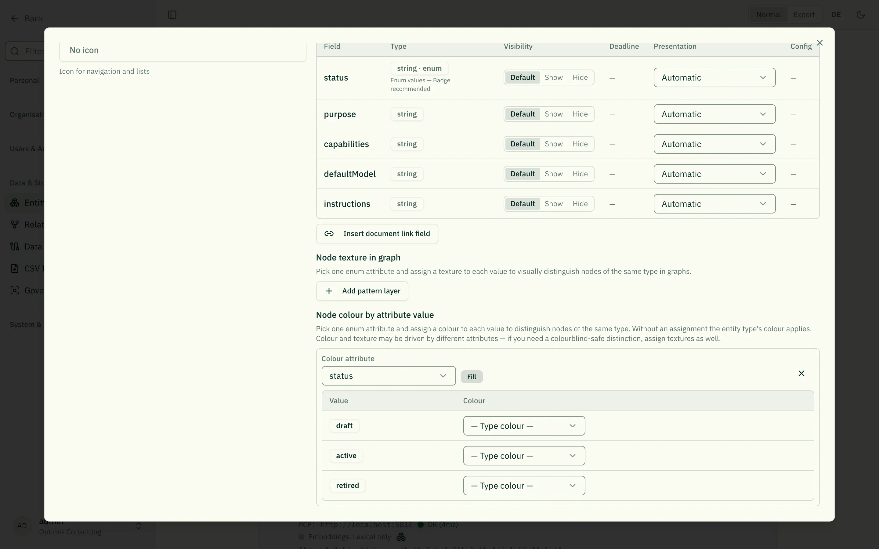 It is stored as
 x-node-color on the schema root:
{ "type": "object", "properties": { "eaType": { "type": "string", "enum": ["application", "capability"] }, "criticality": { "type": "string", "enum": ["high", "low"] } }, "x-node-color": [ { "field": "eaType", "map": { "application": "blue", "capability": "violet" } }, { "field": "criticality", "map": { "high": "red" } } ]}The card of an entity (x-card)
Section titled “The card of an entity (x-card)”In diagram views an entity appears as a card. What that card consists of is recorded in the schema — just like field presentation, colour and texture. That way the same entity looks the same everywhere: in its own view, in the explorer, and in the preview on the detail page.
{ "x-card": { "width": 260, "padding": 0, "slots": [ { "slot": "band", "field": "subtype" }, { "slot": "related-list", "via": "HAS_KEY_RESULT", "valueField": "progress" } ] }}A card consists of slots, rendered top to bottom:
| Slot | shows | needs |
|---|---|---|
band | coloured header with the value of a choice field and the name | field |
title | the name, one or two lines | – |
subtitle | a dimmed line from one field | field |
badges | several fields as small chips | fields |
metric | a number with a progress bar | field |
related-list | linked entries as rows, optionally with a bar | via, optional valueField |
avatars | the linked people as profile pictures | via |
portrait | the entity’s own picture (or its initials) | – |
width is the width in pixels, padding the inner spacing top and bottom. Both feed
into the size of the box, because the diagram must know it before it draws.
Slots that speak about relationships
Section titled “Slots that speak about relationships”related-list and avatars differ from every other annotation: they speak not about
a field but about a relationship. via names the relationship type, direction
the direction (outgoing — the default —, incoming or both).
That is how a role shows the people who perform it: { "slot": "avatars", "via": "EXECUTES", "direction": "incoming" } — the relationship runs from person to role,
so from the role’s point of view it is incoming.
Where the card carries its colour
Section titled “Where the card carries its colour”A card can carry its colour in two places, and tones says which:
"x-card": { "width": 260, "padding": 0, "tones": "band", "slots": [ … ] }"flaeche"(default) — the card body is coloured. The normal case; you need not write it out."band"— the header band carries the full tone, the body stays neutral. This requires abandslot; without one the card would have no colour left at all, and the setting is rejected on save.
What is new is not the meaning — colour still stands for the identity of an entity. What is new is that you decide where it sits. Until now the view decided: the former OKR cascade put the full tone into the header band, every other view into the body — so the same entity looked different depending on where you met it.
A state as a coloured dot
Section titled “A state as a coloured dot”A badges slot may mark one of its fields as a state. That value then carries a
small dot in the matching status colour:
{ "slot": "badges", "fields": ["projectType", "status"], "states": { "field": "status", "map": { "in_progress": "good", "planned": "neutral", "stopped": "critical" } }}Exactly four states are allowed: good, warning, critical, neutral. No free
colours — status colours are reserved for precisely this statement throughout the
application, and a freely chosen colour for “region 3” would devalue every real
warning. Conversely the node palette (x-node-color) stays with categories and
never says anything about a state.
Three things that hold here:
- The word stays. The dot sits before it, not in its place — roughly eight percent of men do not reliably tell red from green apart.
- A value without an entry gets no dot. Not a grey one either: a sign that appears although the mapping is missing claims something about data that is not there.
- Only the named field carries the dot, not every chip in the row.
field must be one of the fields of the same slot. Rename that field later and the
mapping follows; delete it and the mapping goes with it.
What sits inside a card does not sit beside it
Section titled “What sits inside a card does not sit beside it”A related-list slot has a second effect: in the explorer the linked entries no
longer get a box of their own — they are already in the card. A key result appears
there only when its objective is out of view, or when you made it the starting point
yourself. Relationships attached to such an entry visibly lead to the card of its host.
When a node encloses others (x-nesting)
Section titled “When a node encloses others (x-nesting)”Some things contain others: a company its business units, a process group its steps. In the explorer that can be shown as a box — the contained nodes sit inside it instead of beside it:
"x-nesting": { "via": "PARENT_OF", "direction": "outgoing", "wenn": { "field": "orgType", "equals": "company" }}via— the relationship type the children hang from. Without it, any relationship configured as a parent/child relation in your tenant counts.direction—outgoing(default): the node at the start of the relationship is the container.wenn— optional. Only entities whose field carries the given value become a container. Without the condition, nesting happens as soon as there are children.eigenstaendig— optional.truemeans a container of this kind never lies inside another; it always stands on its own. The org chart sets it because a company is not part of another — a shareholding is not membership. Without it, a container may lie inside another (box within box), the way a sub-chain lies in its value stream.richtung— optional,"unten"(default) or"rechts". Which way the content of this box is arranged. A hierarchy reads top to bottom, a sequence left to right; value creation therefore sets"rechts". Affects only the inside — the level above stays as it is.
The box holds everything below it, not just the immediate children: a company encloses its divisions, their departments and their teams. The descent stops at every further container — what lies below it belongs to it. If an entity belongs to two containers, it lies in exactly one (the nearer); the other relationship remains visible as a line.
The box has a solid border and a translucent fill. Both mean something: solid says “this thing exists” (dashed would say “provisional”), and translucent so the lines of the enclosed nodes stay visible.
Two things that apply:
- The relationship that makes the nesting is no longer drawn as a line. The box already says “what lies inside is part of it” — a line beside it would say the same thing twice. All other relationships remain.
x-nestingandrelated-listmust not point at the same relationship type. They mean the opposite: the list says “the entries sit in my card and get no box of their own”, the nesting says “they keep their box and are drawn within my bounds”. The application rejects that on save.
The specialised views (org chart, value creation) bring their own nesting and are unchanged by this. They additionally show things the box alone cannot express — for instance shareholdings between companies.
When data is missing
Section titled “When data is missing”If a list slot refers to entries whose records are not loaded yet, the plain default card appears instead of an empty list. The reason: “no key results” and “not loaded yet” would otherwise look identical, and the first would be a claim nobody checked.
The same applies to mistakes in the declaration: a slot missing its field is skipped — the rest of the card stays. On saving, by contrast, the application reports such mistakes, so a configuration does not quietly end up doing nothing.
Without a declaration
Section titled “Without a declaration”With no x-card in the schema, the entity shows the plain default card: name plus one
line from its choice fields. That is rarely what you want — an objective without its
header band and without its key results says almost nothing. Start from your module’s
shipped template rather than leaving the declaration out.
When we improve the template
Section titled “When we improve the template”The card your entity type received is a copy of the module’s template — from that moment it is yours. If we improve the template later, that copy would stay on the old state forever.
So: as long as you have not touched your card yourself, we carry it along. On the next start the application checks whether your card matches a version we shipped — if it does, you get the new one.
If you have adjusted it, it stays untouched. Even when the change was small. We cannot tell whether you left something out on purpose or whether it comes from an older version — and in doubt the decision is yours. The price is that later improvements to the template no longer reach you; whoever keeps their own card maintains it themselves. The server log names the affected entity types on every start.
Nothing is merged in the process: either the whole card is replaced, or nothing is. A half-lifted card would be neither yours nor ours.
An entity’s kanban board (x-kanban)
Section titled “An entity’s kanban board (x-kanban)”Next to the card, an entity type can declare a board: which choice field spans the columns, and which relationships carry the lanes (swimlanes). With nothing declared, the page offers no board view.
"x-kanban": { "spalten": { "field": "status" }, "bahnen": [ { "id": "rolle", "via": "ASSIGNED_TO", "direction": "incoming", "ende": "gegenueber", "label": { "de": "Rolle", "en": "Role" } }, { "id": "person", "via": "ASSIGNED_TO", "direction": "incoming", "beteiligte": "holder", "label": { "de": "Person", "en": "Person" } } ]}spalten.field must be a field that exists in the schema and carries a choice list
(enum). Without one there would be no fixed set of columns but as many columns as values
happen to sit in the data — a board whose shape depends on the data is not a board. The
order of the columns is deliberately not part of this declaration: it comes from your
enum order. Two sources for the same order would drift apart at the next rework.
Each lane names a relationship (via) and one of two questions to ask of it:
| Setting | The lane carries … |
|---|---|
"ende": "gegenueber" | whoever sits at the other end of the relationship (for ASSIGNED_TO: the staffed role) |
"beteiligte": "<slot>" | whoever is a participant on the relationship itself (for ASSIGNED_TO, slot holder: the people who fill the role on this project) |
Both at once would be two axes under one identifier; neither would be an axis without a value.
The application rejects both when saving. direction reads like on card slots (incoming —
someone points at me, the default — outgoing, both).
Two things you need to know:
- A lane is also a data requirement: the named relationship type must exist in your tenant. If it does not, the interface does not offer the axis at all — it would only show empty bands, and that would look like “nobody is assigned”.
- Rename the column field and the schema migration carries the declaration along. Delete it and the whole declaration goes — a board without a column field would have no meaning.
How the board feels for the people using it: Kanban board.
Legend and filter
Section titled “Legend and filter”Wherever colours or patterns apply, a legend explains which value stands for what. Every entry is also a filter: one click dims the affected nodes — they stay in place and merely recede.
This holds in every view that draws these encodings: the explorer, the role circle view, the relationship graph (2D and 3D), the neighbour graph on the detail page and the graph tile on the dashboard.
Layers that are not drawn appear in the legend too — every further colour or pattern layer is listed there with the note “legend only” and can still be filtered. A configured layer without a legend entry would otherwise be invisible and unfilterable at the same time.
Replicas get their own entry: mirrored entities carry diagonal stripes and a dashed border. The border is needed because a configured texture occupies the same channel as the stripes — this way a replica stays recognisable even when the node also carries a pattern. The entry only appears when the view actually contains replicas.
Dimming rather than hiding is intentional: the explorer and the role circle view draw trees. If filtered nodes disappeared, their children would dangle or vanish with them. A value filter is also a reading aid (“where are the applications?”), not a data reduction.
Filter and search add up: a node recedes when the search doesn’t match it or its value is deselected. The filter applies to the current view and is not saved.
Full example
Section titled “Full example”A schema combining several features:
{ "type": "object", "properties": { "name": { "type": "string", "title": "Name", "minLength": 2 }, "description": { "type": "string", "title": "Description", "multi": true, "x-presentation": "long-text" }, "status": { "type": "string", "title": "Status", "enum": ["draft", "active", "archived"], "default": "draft", "x-presentation": "badge" }, "blockReason": { "type": "string", "title": "Blocking reason", "multi": true, "showWhen": { "field": "status", "values": ["archived"] } }, "validFrom": { "type": "string", "format": "date", "title": "Valid from", "x-presentation": "date-relative" }, "tags": { "type": "array", "title": "Tags", "items": { "type": "string" }, "uniqueItems": true, "x-presentation": "chip-list" } }, "required": ["name", "status"]}Related
Section titled “Related”- Entity Types — What entity types are and what they do
- Normal & Expert Mode — Normal vs. expert mode,
x-presentation - @-Mentions — @-mentions in text fields
- Linking documents — linking documents (the link only, never the file)
- Kanban board — the board this declaration produces