

The relationship graph
The graph shows a tenant’s entities and their links as a network. Unlike the lists and the remaining specialised views (role circles, meeting cadence, clusters), it mixes all modules: roles, processes, objectives, policies, risks and people sit side by side on one canvas.
Since 09/2026 the same canvas also draws the areas that used to have a view of their own — org chart, value streams, OKRs and projects. Those four hand-built views are gone; they showed the same thing but could only ever look one way, while the explorer draws the card from the entity type’s declaration.
The explorer is available in every area too
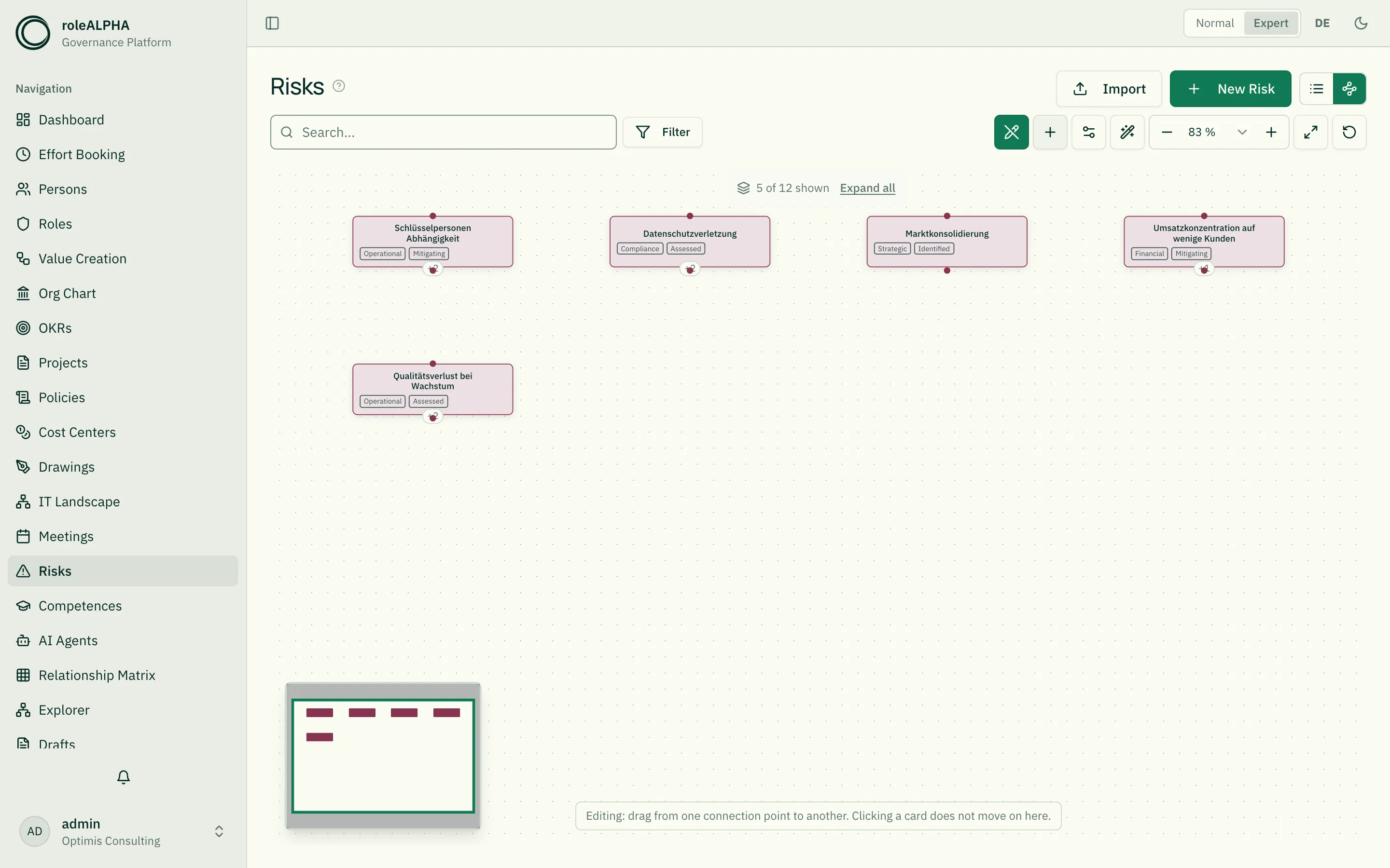
Section titled “The explorer is available in every area too”Since 08/2026 the explorer is no longer a page of its own. Every area — people, roles, risks, competences, cost centres, demand, AI agents and all the rest — has a second button next to the list, and behind it lies the same set as a network.
The order is the same everywhere: list → explorer → specialist view. Where a specialist rendering exists that shows something other than a relationship network (role circles, meeting cadence, clusters, drawing gallery) it sits as the third button — it has not gone away, it has moved along.
A page that used to open with a picture still opens with a picture. Org chart, value streams, OKRs and projects open in the explorer, roles in the circle view, all the rest in the list.
What you see there. The whole set of that area on one surface — folded at first if the set is large, see “How many levels the picture shows”. And because a “+3” mark on a node also counts neighbours from other areas, you can carry on from there: from the risk list you see which processes and roles hang off a risk — without changing page. A click on the mark pulls them in.
Six areas had no picture at all before: people, risks, competences, cost centres, demand and AI agents. They have one now.
And you can work there, not just look. The pencil in the toolbar switches on edit mode in the area too: draw relationships, move an end, change one, delete one — and with the plus next to it create a new entity straight from the canvas. Until now you had to switch to the graph page and find your entity there first to set it as an anchor.
Whether the pencil appears depends on this one area: whoever may draft in risks sees it under risks — and not under people.
The explorer — the default view
Section titled “The explorer — the default view”Opening “Graph” lands you in the explorer. It does not show the whole tenant at once; it starts at one thing and moves on from there step by step.
The anchor is marked. It carries a strong ring in the accent colour and a small compass sign at its top right. Both deliberately stand apart from the entity-type colours — in a picture with a hundred boxes, a slightly thicker border cannot be found.
The anchor. With nothing else specified the explorer starts at your own person: you see what you yourself are attached to — your roles, your unit, your objectives. If no person is linked to your account, a anchor picker appears instead; search there for an entity.
Moving on. If a node carries a small badge such as “+3” at the bottom, three more neighbours lie behind it that are not yet drawn. Clicking it brings them in.
Clicking the node itself first brings it closer — it zooms in and centres the card. Only the second click on the same card makes it the new anchor (or, inside an area, opens its detail view); the address travels with you, and the browser’s back button retraces your path. Click a different card and it starts over there; a click on empty canvas clears it.
The intermediate step is deliberate: at overview zoom a card in a large set is a tiny box, and re-anchoring discards everything you expanded and ends a running search. The first click makes it readable before that happens. The same rule applies in the role circle. (Not in edit mode, see below.)
The badge keeps its size as you zoom out rather than shrinking with the picture, so it stays easy to hit precisely when the boxes get small. And it is more generous than it looks: a click just below it, or slightly to either side, expands as well. Deliberately not above — that is where the card starts, and a click on the card means “carry on from here”.
Whatever you bring in is placed into the existing picture: expand twenty roles on a person and they end up attached to that person, joined to it — not parked beside it as a separate block. The node you touched stays where it is on screen, even as the rest of the picture rearranges.
The number counts only what you are allowed to see. Anything invisible to you neither appears there nor is counted.
How the picture is arranged. Relationships expressing a hierarchy or a sequence determine the arrangement: they run above/below or one after another. All others — who executes something, who is accountable, what applies, what funds, what is supported — connect the picture as coloured cross links. They too hold their nodes together in the picture: anything attached only by a cross link is placed next to its neighbour rather than off to one side. What they cannot do is reorder the hierarchy — that remains the job of hierarchical relationships. Which class a relationship type has is set by the tenant admin (see relationship types).
A relationship whose meaning is not recorded appears in a warning colour — it is explicitly not treated as a hierarchy.
Shape, colour, dash pattern, arrowhead and hovering behave exactly as in the other graphical views — described once under Reading lines in graphical views. Above the canvas sits a legend of line kinds: which colour stands for which class of meaning, which line is mere arrangement, and which belongs to a scenario.
Labels can be switched off. In a dense picture, dozens of words between the lines are more noise than help; in a sparse one they are the most important thing. The switch sits with the other controls, and your choice is remembered.
The same picture in three sizes
Section titled “The same picture in three sizes”An entity’s neighbourhood appears in three places: as a preview in the simple mode of the detail page, as a larger graph in the expert mode of the same page, and full size in the explorer. All three show the same structure with the same arrangement, the same colours and the same line styles. Switching between them is zooming in, not changing the subject.
In the detail page’s side panel, clicking a node still means jump to the entity — not “move on”. To explore within the picture, use “Open in explorer”. The reach is set there via the hop control.
Jumping into the explorer from an entity
Section titled “Jumping into the explorer from an entity”On an entity’s detail page, “Open in explorer” takes you straight into its neighbourhood. The link can be copied and shared: whoever opens it sees the same section — provided they may see the entity. If it is unknown, deleted or invisible to them, the same neutral notice always appears.
What a line means
Section titled “What a line means”Every line carries the name of its relationship — “executes”, “applies to”, “is funded by”. Read it in the direction of the arrow. That makes it visible whether a role executes a process or is accountable for it.
The wording comes from the relationship type: if a custom translation is stored there, that is what the graph shows. If the picture gets too dense, the names can be hidden under Settings → Display → Relationship names. On very large graphs the view hides them by itself so the canvas stays readable.
Looking at a relationship in detail
Section titled “Looking at a relationship in detail”Clicking a line opens its detail area above the graph. It shows:
- the full sentence — “The role Product ownership decides on Quotation”
- the attributes of the relationship, where the relationship type defines any (decision limit in euros, capacity share, percentage …)
- the further participants: people who actually fill this assignment — clickable, so you can carry on from there (see Participants in a relationship)
The two buttons take you straight to the entities at either end. Clicking the same line again, or the close icon, hides the area.
Relationships with participants
Section titled “Relationships with participants”A relationship can have more than two ends. A role assigned to a project is filled by specific people — those participants belong to the relationship, not to either of its ends (see Participants in a relationship).
The explorer shows this by itself: a small hexagon then sits on the connection. The relationship becomes edge → hexagon → edge. There is no switch for it — the hexagon is small enough to always be there where there is something to show.
Bringing the participants into view
Section titled “Bringing the participants into view”Participants belong to the relationship, not to either of its ends. The explorer therefore does not find them when you step from node to node — they only appear once you fetch them.
Next to the hexagon sits the same “+N” mark you know from a card: it says how many participants are still outside the picture.
- One click on the mark brings them in.
- Two clicks on the hexagon do the same — the first pulls it close and centres it, the second acts. The same rule as on any card.
The participants then appear as cards of their own, with lines running from the hexagon to them. The anonymous connection turns into the full statement: this role is staffed on this project, and it is filled by these people.
Once everything is there, the mark turns into an upward handle — one click takes the participants back out. Only the single card is fetched, never its whole neighbourhood; to carry on from there, use the “+N” mark on the new card.
The picture lives in the address: share the link, or come back from a detour to a detail page, and the same participants are there again.
The small preview image on a detail page and the neighbourhood pane are not for exploring — there the mark only states the number.
What a node looks like
Section titled “What a node looks like”What a card looks like is stated by the entity type through its declaration, not by the view. An OKR carries a header band with its kind, the title, and below it the key results with progress bars; a project shows type and status; an org unit shows the people assigned to it. Everything else carries a slim card with name, kind and its module’s selection fields.
That is why the four former specialist views could go: a hand-written node component knows exactly one appearance, and a tenant may run several entity types with different renderings for the same module.
Where an entity sits in the hierarchy is stated by the small line above its name — the same path as in the list and on the detail page. It shows the two nearest levels; the full way up is in the tooltip. That is more than the picture itself can give: an entity’s ancestors almost always lie outside the drawn section.
What a card shows is complete — even when the picture is not. A role held by six people shows six faces; an objective with five key results shows all five. That holds even when those people or key results are not drawn as boxes of their own, because they sit one step further out. Where they do not all fit side by side, a count closes the row (“+3”).
For a while this worked differently, and misleadingly so: a card showed only whoever the currently loaded section happened to know — the same role with one person or with six, depending on where you looked at it from. An objective whose key results were not loaded even read ”—”, which means “none” and was simply untrue.
People remain nodes of their own regardless. A face on a role card is a summary, not a replacement: that same person has relationships of their own, and those should stay visible in the picture.
When a node encloses others
Section titled “When a node encloses others”Some things contain others — a company its business units. Then the boxes do not sit side by side: the container draws a box around its children, its own name at the top, the contained nodes inside.
The border is solid — the thing exists; dashed would say “provisional”. The fill is translucent so the lines of the nodes inside stay visible. The relationship that makes the box is not drawn again as a line: the box already says “what lies inside is part of it”. All other relationships remain.
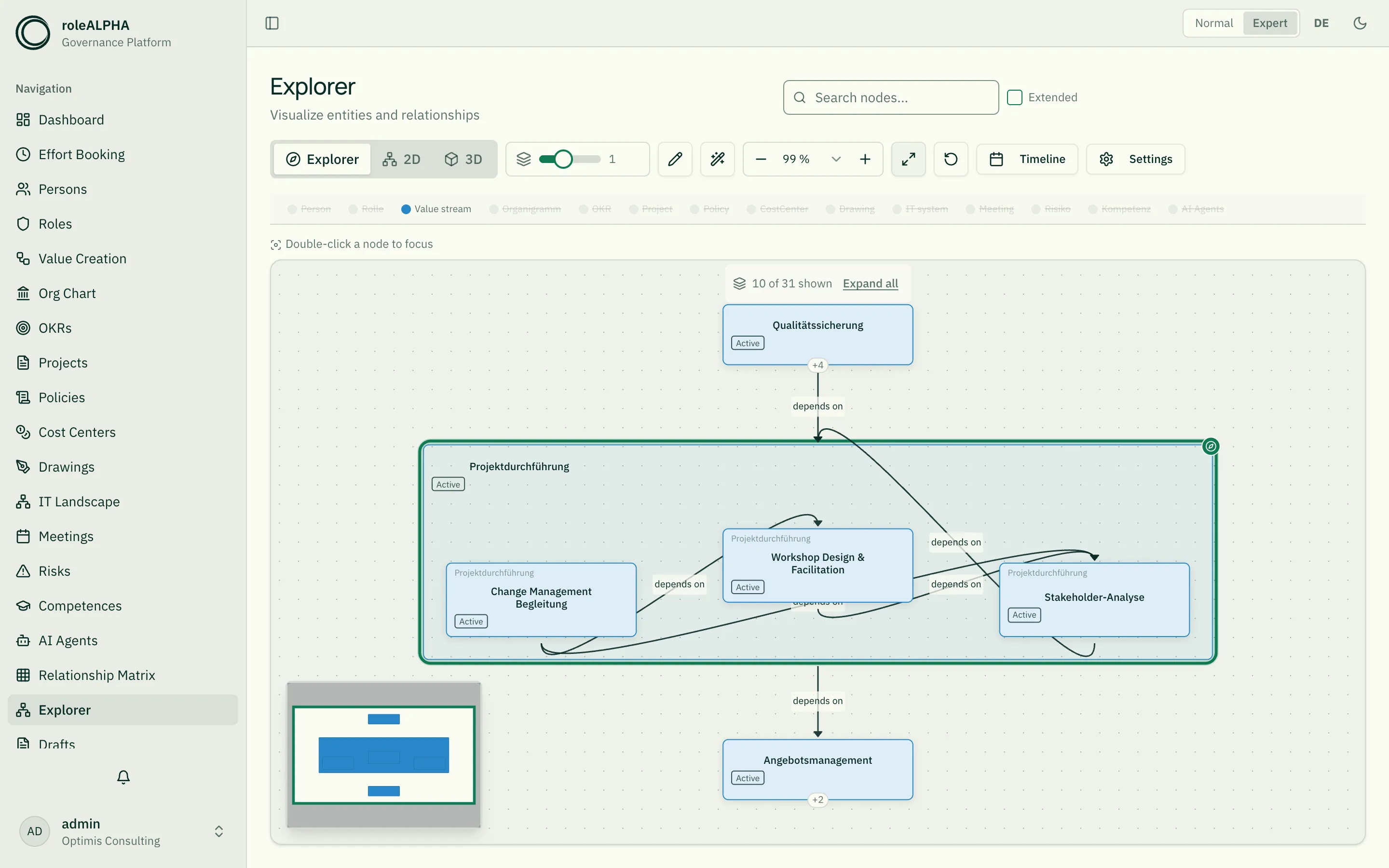
The box holds everything below it, not just the first level. A company encloses its divisions, their departments and their teams — as deep as the tree goes. When you expand a unit, the new nodes move into the box instead of sliding below it.
Box within box. If something inside is itself a container, it gets its own box and keeps what lies below it — a sub-chain within a value stream, for instance. Some containers always stand on their own, though: a company never lies inside another, because a shareholding is not membership. It gets its own box beside it, and the relationship remains visible as a line.
A box can have its own reading direction. A hierarchy reads top to bottom, a sequence left to right — inside a value stream box the steps therefore sit side by side, while the picture around it still reads top to bottom.
If something belongs to two containers, it lies in one of them and is connected to the other by a visible line. It cannot lie in both boxes at once — the line says that the second membership exists all the same.
Whether and when a node encloses depends on the entity type — your tenant admin configures it there (help: “Entity types and schema”). In the org chart, for instance, exactly those units marked as companies enclose.
Values on connections
Section titled “Values on connections”Some relationships carry a value: a shareholding its percentage, a supply relation its quantity. Where your tenant admin has configured this, the value appears on the line — “holds shares in · 51 %”.
Settings lets you control this, and separately: relationship names and values on connections are two switches. Turn the names off and the values on, and only the figure remains on the line.
This switch used to exist on the graph page only — inside an area there were no settings at all. Now the gear in the toolbar opens them there too.
When many things hang off one node
Section titled “When many things hang off one node”If more than a handful of neighbours hang off a single node and are connected to nothing else — two dozen roles on one person, say — they are not laid out in one long row but as a block below it. A row of 26 boxes would be several screens wide; the block fits the picture.
Inside it, each kind gets its own cloud: a grid of its own, roughly square, sorted alphabetically. The clouds sit side by side, with noticeably more air between them than between the boxes of one cloud — that spacing is what makes them read as groups at all. Only when a row of clouds would grow wider than a screen does it wrap, and the next clouds sit below.
Anything that leads on further stays out of the block. If a neighbour has relationships of its own it remains in the tree — otherwise its connection would run right across the picture.
How many levels the picture shows
Section titled “How many levels the picture shows”Inside an area, the explorer shows the entire set — and that set can be large. An org chart with 2,000 people would, unfolded, produce a picture that fits at 11 % zoom and consists of 20-pixel boxes: complete in principle, unreadable in practice.
So a large set opens folded. As many levels are shown as you can take in at a glance; everything below stays out at first. A small set is not folded — folding is a concession to size, not a permanent state.
A flat set stays whole too. Where most entries sit on the top level anyway, folding would gain little — but it would take away the boxes, because a box only encloses what is actually drawn. So folding only happens when it at least halves the picture.
The picture says so. Above the canvas it states how many of how many units are visible, with an “expand all” button next to it.
The slider in the toolbar sets the number of levels — “All” at the right end. It is the same slider that controls the steps around the anchor in the graph view; its tooltip says which of the two meanings currently applies. There is never both at once: an area has no anchor, and the graph view has no tree to fold.
The slider restores the area. If you pulled in cards from other areas via the “+N” mark — people on a role, roles on a process — every move of the slider takes them back out. Otherwise they would stay while the card they hang on disappears behind the fold: tiles without a single connection that look like part of the inventory. Nothing is lost — the “+N” mark is back on every card, and one click brings the same neighbours in again. Your own arrangement stays as well.
On a single node it is the same “+N” mark as always. It counts both things that sit behind a card: neighbours not loaded yet and subordinates folded away. To you that is one and the same fact — there is more here — and one click brings in both. The upward handle folds it back.
Your arrangement stays — for this visit. Move cards around inside an area and you will find them as you left them after jumping to a detail page and back. Until 09/2026 that was not so: the memory hung on the starting point, and an area has none — so nothing was remembered there. A reload or a new tab still deliberately starts with a fresh layout.
The wand in the toolbar discards your arrangement and puts everything back on its calculated place — folding and starting points stay as they are. That is what sets it apart from “reset” next to it, which restores the whole initial state.
The page’s search box works here too. Type into the search bar above the canvas inside an area and the matches stay bright while everything else dims — the same search that filters the list. If it finds nothing, the bar says so and offers to clear the search. Until 09/2026 the search box did nothing in this view: the picture stayed as it was, while the same input worked in the list and in the specialised view.
Search reaches behind the fold. If a match sits in a folded branch, the branch is opened so you can get to it. Clear the search and the fold is as it was.
The side panel of a detail page and the thumbnail do not fold: they only show the neighbourhood around one entity anyway, and trimming that a second time would take away exactly what you opened it for.
How far the explorer looks
Section titled “How far the explorer looks”The slider on the left of the bar sets how many steps around the anchor are loaded. The default is one step: the immediate neighbourhood and nothing else — a manageable way in.
The second step is more than more volume. Two entities that are not directly connected but share a third one — two roles of the same circle, say — sit next to each other without any visible relation at one step; only at two steps does the third one appear and the order becomes visible. The price is volume: measured against real data, 35 boxes became 91. So if a picture looks unconnected, push the slider one notch further.
At the far left sits zero: then you only see the anchors themselves, without their neighbourhood. That is the tidiest way in when you want to place two things side by side and connect them — and you can still move on from there, because the “+N” badge on each node keeps counting its neighbours.
The value lives in the address (?hops=2), so it travels with the link when
you pass it on; the default is not written into it.
Working the canvas
Section titled “Working the canvas”The explorer is operated like a whiteboard:
- Pan — grab the empty canvas with the right or middle mouse button and drag. Space + left mouse button pans as well, as in drawing tools.
- Right-click a card or a line — opens a menu with what you can do with that particular thing (see the next section). Panning is unaffected: hold the right button and drag and you pan; just click and you get the menu.
- Select several cards — drag a box with the left mouse button on empty canvas. Everything the box touches is selected; selected cards get a distinct outline.
- Move them together — drag one of the selected cards and all selected ones follow. That is how you tidy a dense picture in a few gestures instead of card by card.
- Take the subtree along — drag a card that has things hanging off it (a department with its teams, a parent project with its subprojects, an objective with its sub-objectives) and everything below it comes along. That keeps the arrangement readable instead of falling apart with every drag. To pull a single card out of its subtree, hold Alt while dragging. A box (see “When a node encloses others”) takes its contents along anyway — there, belonging is the whole point.
- Clear — click the empty canvas, or the cross in the bar that appears while something is selected.
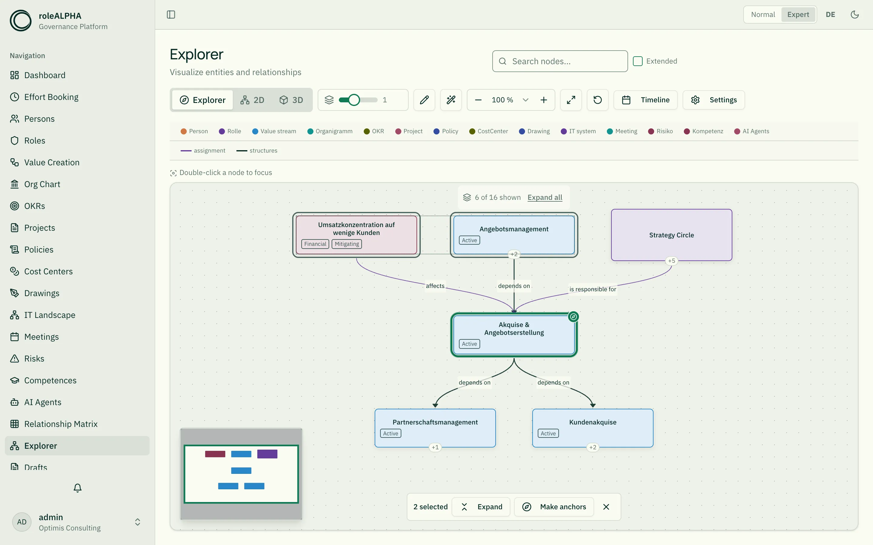
- Zoom — scroll wheel over the canvas, or the zoom level in the control bar (see below).
Three things worth knowing before you go looking for them:
- A second box replaces the previous selection, it does not add to it.
- A box only catches what is visible. The canvas holds still while you drag — it does not travel along when you reach an edge. That is deliberate: a travelling canvas moves the cards out from under the pointer, and the box grows along with it, so what ends up selected is not what you dragged. To catch more, pan first (right or middle mouse button) or zoom out.
- Clicking a card does not select it — it brings the card closer, and a second click on the same card moves on. That is the more important gesture here, and putting both on the same click would make one of them unreliable. Everything else you can do with that card lives in the right-click menu.
Your arrangement — and when it no longer fits
Section titled “Your arrangement — and when it no longer fits”Whatever you move yourself, the explorer remembers for this visit: you can jump to a detail page and come back without setting up your picture again. A reload, a new tab or a different starting point deliberately begins with a fresh layout.
While your own positions are in effect, Auto arrange (the wand) in the control bar is highlighted; clicking it discards them and restores the computed layout — folding and starting points stay as they are.
If the inventory changes meanwhile — someone imports, creates or deletes — your remembered places no longer match what is on screen. The same button then gets a warning ring: the arrangement still lies over the new picture but was meant for a different one. One click tidies up.
Without a mouse: tab to a card and select it with Enter or Space.
On tablets nothing changes — one finger pans the canvas. There is no right-click menu there (there is no right button); everything in it is also reachable through the marks on the cards, the toolbar and the selection bar.
Right-click: what a card and a line offer
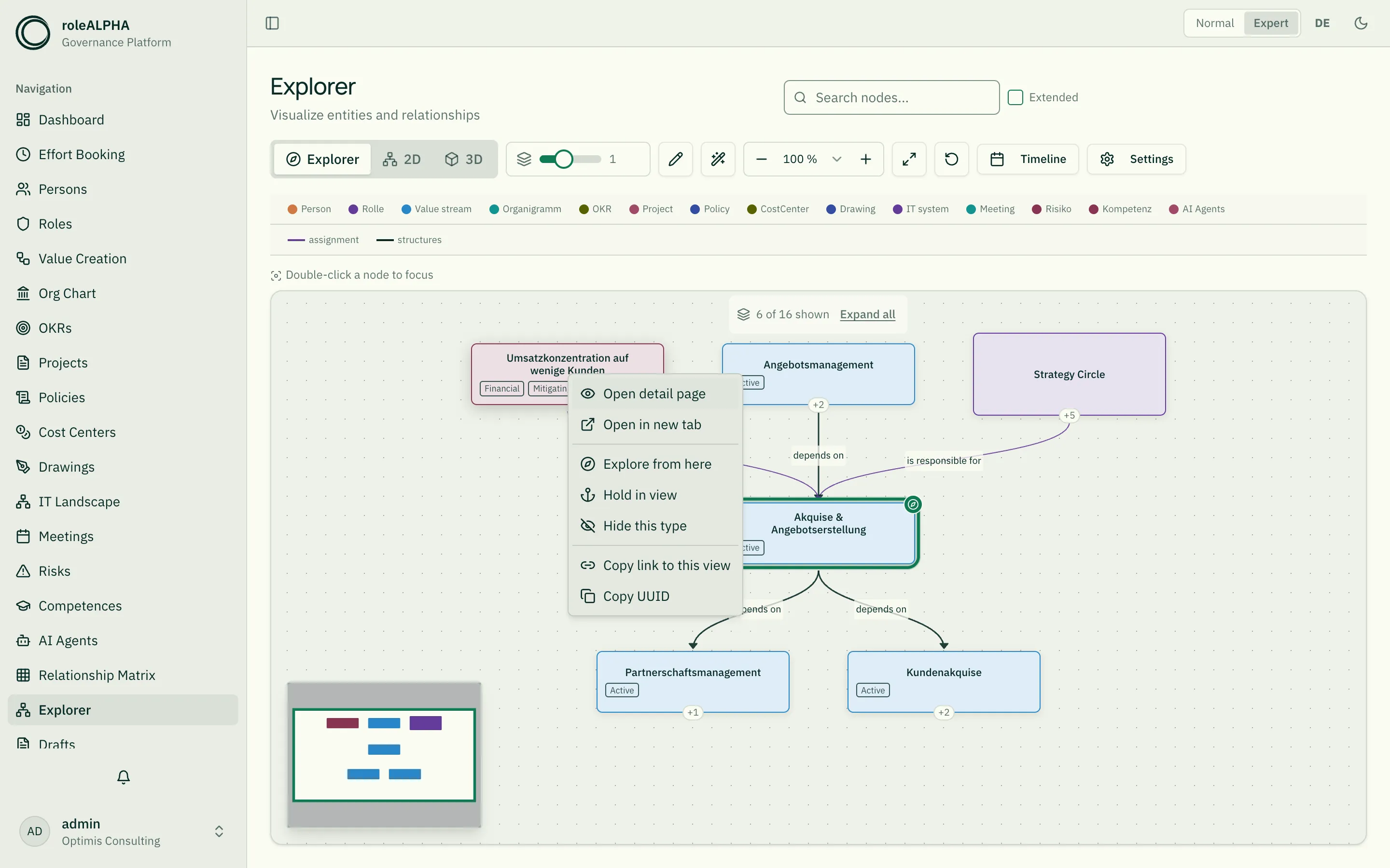
Section titled “Right-click: what a card and a line offer”A right-click opens the menu right where you are — instead of hunting along the edge of the canvas or having to know the action exists at all. Anything that does not apply to this card, or that you lack the permission for, does not appear.
On a card:
- Open detail page — the jump out of the canvas. The browser’s back button brings you back to the same picture: same anchors, same expanded nodes, same arrangement. Open in new tab leaves the canvas untouched altogether.
- Explore from here — the same as a plain click: the card becomes the anchor and the rest of the picture is replaced.
- Hold in view — the card becomes an additional anchor and therefore stays in the picture even when you move on elsewhere. If all six anchor slots are taken, the item is greyed out and says why.
- Release anchor — the reverse, for every anchor: the next one takes over and carries the picture on, and what is expanded stays expanded. On the last remaining anchor the item is absent — the canvas would be empty afterwards.
- Load further neighbours / Collapse — the same as the “+N” mark at the card’s edge, only larger and named.
- Hide this type — the quickest way to clear a picture crowded with a hundred cards of the same kind. Reversible at any time via the legend.
- Create connected entity and Delete entity — only in edit mode and only with the matching permission. Deleting takes the same route as in the lists, with a confirmation.
- Copy link to this view and Copy UUID.
On a line (and on the hexagon of a relationship with participants):
- Show relationship — opens the detail pane above the graph.
- “Open …” for each of the two ends, each by its name.
- Hold both ends in view — makes both of them anchors; the connection stays in the picture no matter where you move on.
- Edit relationship and Delete relationship — only in edit mode.
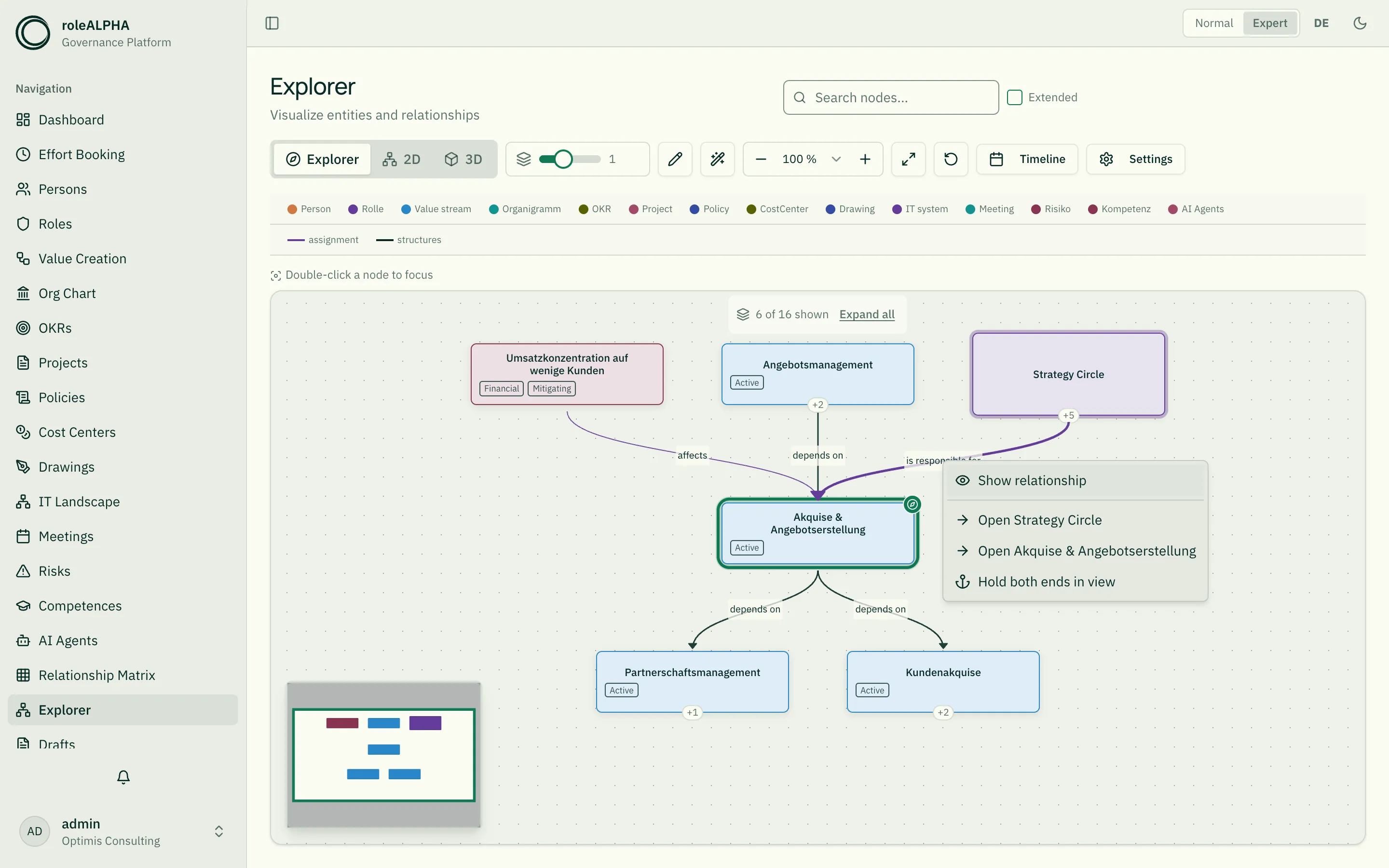
The empty canvas deliberately has no menu: that is where the right button pans, and what you can do there lives in the toolbar.
What you can do with a selection
Section titled “What you can do with a selection”As soon as something is selected, a bar appears above the picture. It first says how many cards are meant, and then offers:
- Expand — every selected card at once, instead of pulling each “+N” handle separately.
- Open — only with exactly one card selected: jumps to its detail page. The same jump as in the right-click menu, here also without a mouse.
- Make anchors — the selected cards become anchors of the picture. This is how you place several not-yet-connected things side by side. There are six anchor slots; if not all fit, as many as possible are taken and the number of the remaining ones is reported.
- Create connected — only in edit mode and only with exactly one card selected: it creates a new entry and then opens the dialog to connect it to the selected one (see below).
- Delete — only in edit mode and only where you have the permission. A confirmation comes first: it breaks the selection down by kind of entity (“12 roles, 3 policies”) and names what you lack the permission for. Deleting runs the same way as in the lists: either as a draft that goes through approval, or deleted and published directly. Relationships to those entities disappear with them.
What happens next
Section titled “What happens next”With “Delete & publish” the cards and their lines disappear immediately — no page reload needed. This applies to both modes: the graph view as well as the explorer of a subject area.
If the deleted card was the starting point of your exploration, the view jumps back and tells you so. If you had set several starting points, the remaining ones take over and the picture stays.
If your tenant requires approval for deletions (consensus, consent, highlander), nothing is deleted right away — roleALPHA then reports “delete drafts created — approval still pending”, and the cards stay until someone approves. If your tenant also requires a change comment, the message says so too; add it in the field of the confirmation dialog and repeat. If only part could be deleted, the message names both numbers and the reason for the first failure.
With “As draft” explicitly nothing is deleted: only delete drafts are created, and the cards stay in the picture. The planned deletion becomes visible only once you turn on “Show drafts” in the legend — the affected cards then appear dashed and semi-transparent. The drafts are decided under Drafts.
The controls
Section titled “The controls”Above the picture sit step count or level count, edit, zoom level, fit and reset. In the graph view the first slider controls the steps around the anchor, inside an area the levels shown.
The zoom level shows as a percentage how close you currently are. Pick a fixed level (10 % to 400 %) or change it step by step with − and +. The display follows the scroll wheel and “fit” as well — it always shows the true value, including an odd one like 137 %. At the limits the buttons are disabled.
Settings holds the switches you set once and rarely touch again: relationship names (the labels on the connections), values on connections, show drafts and the minimap in the bottom left. They live there rather than in the row because space above the picture is scarce — and what you need constantly should keep it.
On the graph page the gear in the header opens these settings; inside an area it is the gear in the toolbar above the picture. The switches themselves are the same and are remembered — the explorer looks the same on every page.
The row also shows only what fits the mode: the scenario picker appears in edit mode only (if you are just looking, you are not changing anything), and the timeline disappears there — drawing into an earlier state is not the point.
There is also edit (the pencil) and, once it is on, the plus for creating — see the next sections.
Reset brings back the starting state: only the first anchor and its direct neighbours, neatly fitted. Anchors added later are dropped in the process.
The picture follows the anchor. When you switch anchors or add one, the viewport moves so that it is on screen — even when not everything fits legibly. Otherwise you could move on and end up staring at empty canvas although the picture has loaded completely.
Placing two things side by side — and connecting them
Section titled “Placing two things side by side — and connecting them”The explorer shows what is reachable from your anchor through relationships. An entity that has no relationship at all therefore cannot appear in it — and that is often exactly the one you want to attach.
Bringing it in. Search for it above. If it sits outside the drawn
excerpt it appears in the results list on the right. There are two ways
from there: the name itself makes it the new anchor (replacing
the current picture), the plus next to it places it on the canvas as
well. Both anchors then carry the ring and the compass mark; in
the address they are separated by a comma (?anchor=…,…), so the link can
be shared and survives a reload.
The address also holds what you have expanded (?open=…). A shared link
therefore shows the picture you had in front of you, not just the point you stood
at — and after a jump to a detail page the back button brings exactly that picture
back. Cards you moved yourself stay put as well, though only within the same
browser tab: a reload arranges them afresh.
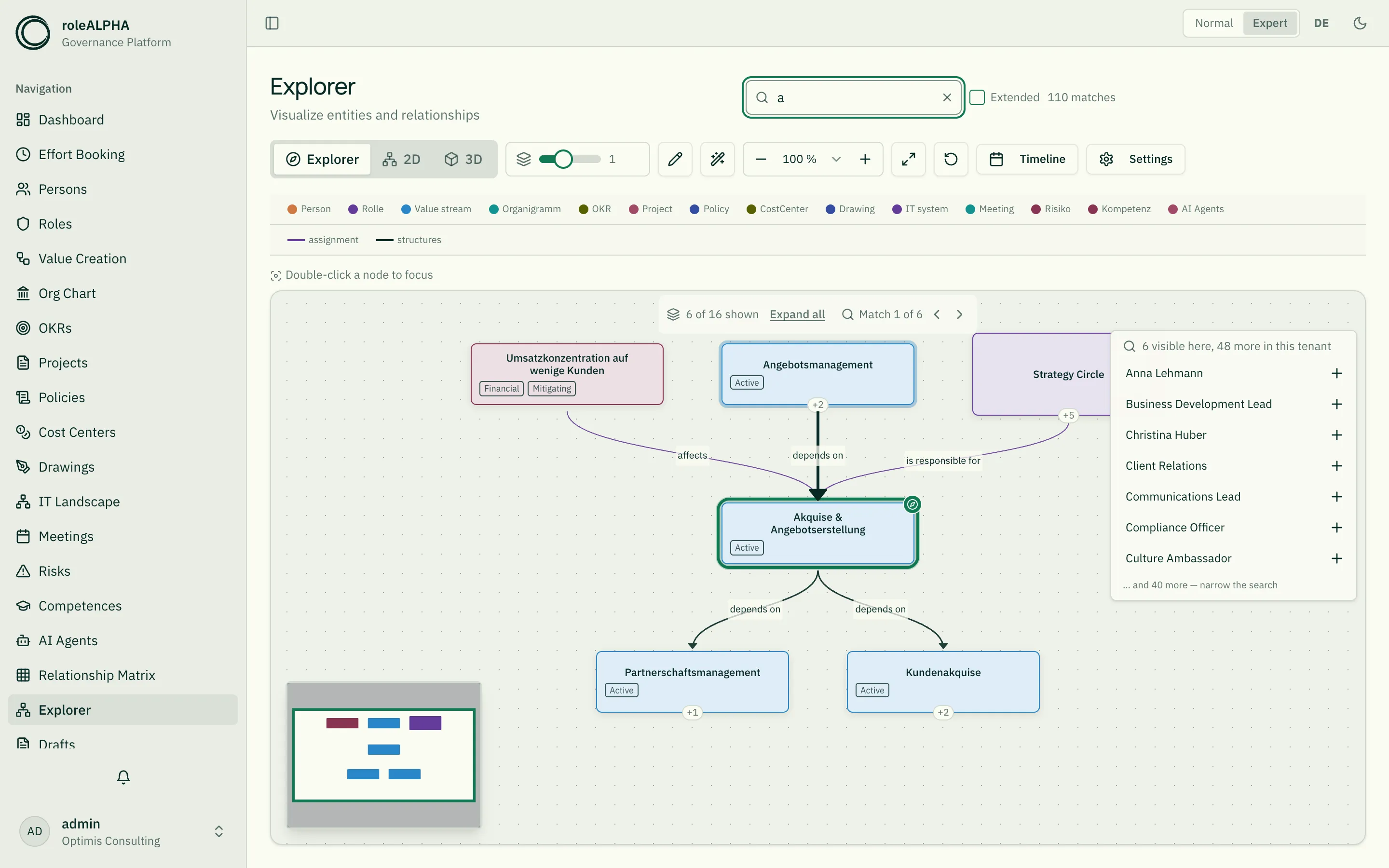
Once it is placed, the search field clears — on both routes. The search has served its purpose, and a filter left lying over the picture would grey out exactly what you just brought in.
The same goes for every other change of anchor: the second click on a card, Explore from here in the right-click menu, and the starting-point list on the empty canvas. Changing the anchor loads a whole new neighbourhood — with the search still lying over it, all of it would be greyed out.
More than six anchors are not possible — each one is a query of its own. You take an anchor away again via the small minus at its top left corner — the counterpart to the plus in the results list — or via Release anchor in the right-click menu. That works for every anchor, including the first: the next one then takes over and carries the picture on. Only the last remaining one cannot be released, as the canvas would be empty afterwards.
Connecting. The pencil in the toolbar turns on edit mode. Small connection points then appear at the top and bottom of every card. Drag from one node to another and the same dialog opens as when linking in the 2D graph: direction, relationship type, plus attributes and participants where the type has them. Only the relationship types allowed for these two kinds are offered; if there is none, the view says so instead of showing an empty list.
On the graph page the explorer mixes all modules, and that is where a connection across module boundaries can be drawn — person to application, role to competence, process to risk. Inside an area the canvas only ever carries nodes of that module; anything beyond hangs off the “+N” badges and comes in when you fetch it.
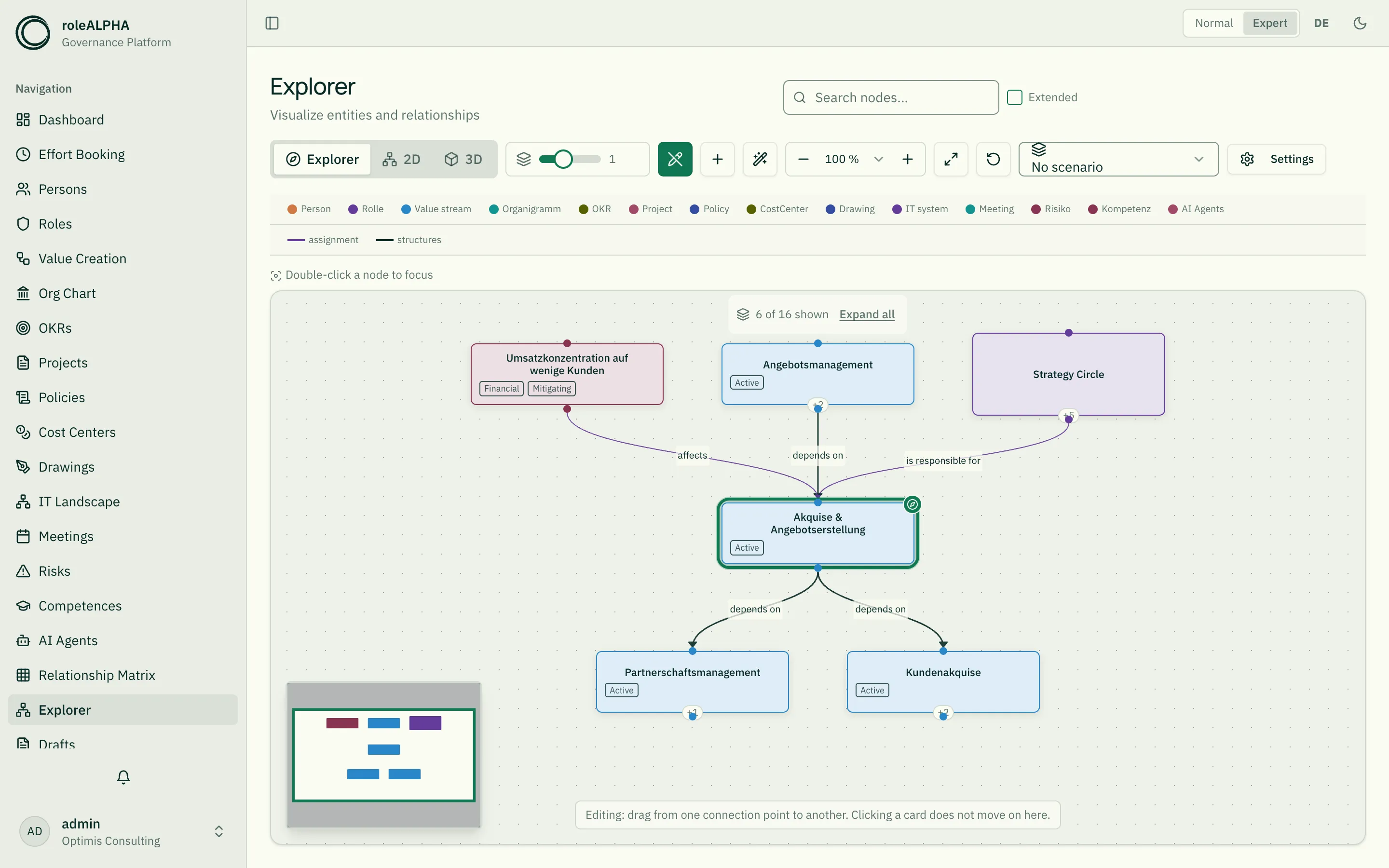
Two things change in edit mode, and the view says so below the picture:
- Clicking a card no longer moves on. Otherwise a mis-click could cost you the whole arrangement you are working on.
- Saving goes through a draft, as everywhere else. “Save & publish” draws the line right away. “Save as draft” files it for approval — it becomes visible as soon as you turn on show drafts under Settings (see below and Drafts).
The pencil only appears if you are allowed to create something somewhere at all. Whether a particular connection goes through additionally depends on your rights at both ends.
Editing, moving or deleting an existing relationship
Section titled “Editing, moving or deleting an existing relationship”Clicking a line opens its detail area above the graph (see below). In edit mode two buttons sit there:
- Edit opens a dialog with what currently applies — type, attributes and participants are pre-filled. Changing only the type loses nothing else.
- Delete asks first, with a note field, and then removes the relationship. Both entities remain.
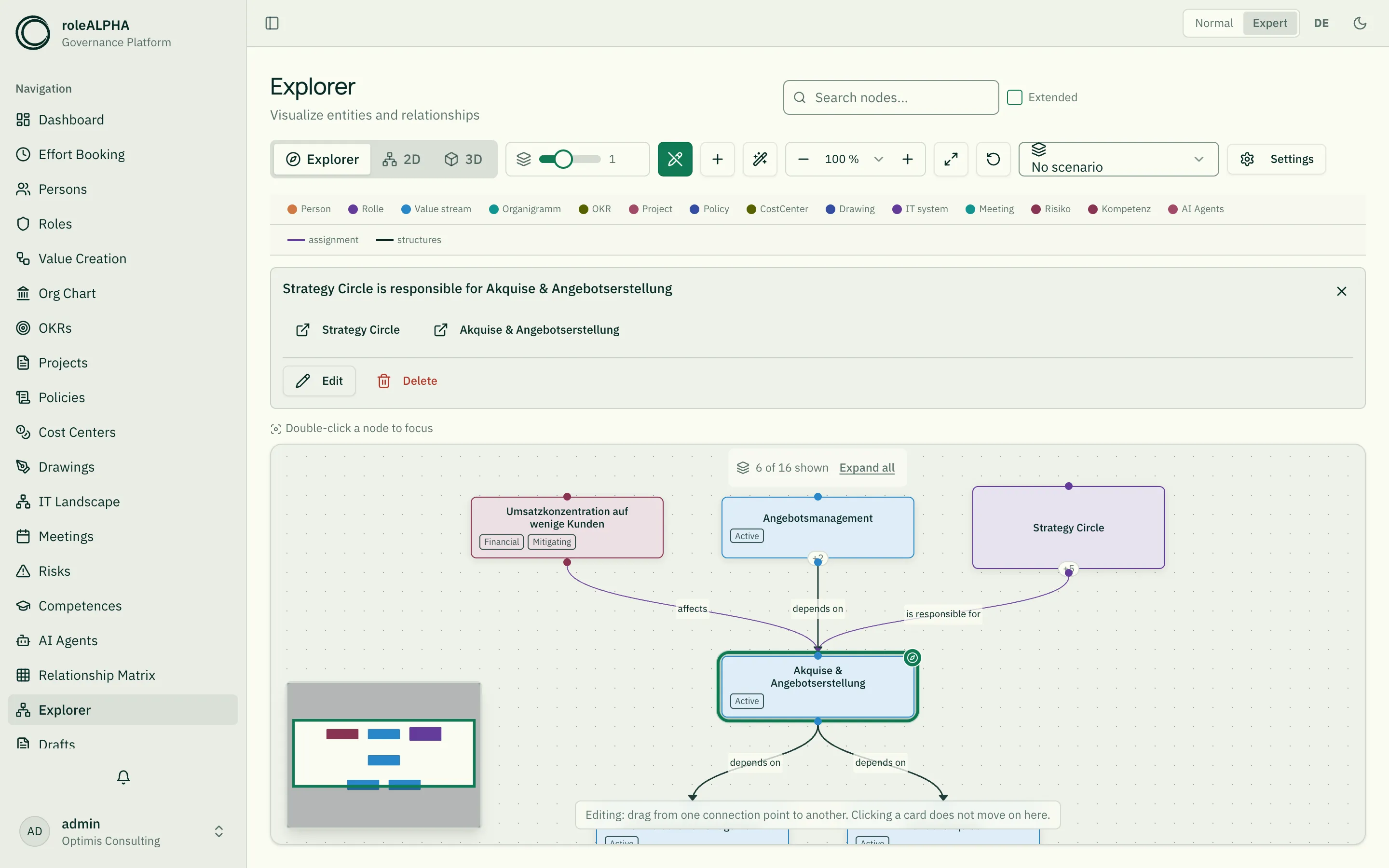
Moving deliberately has no button: grab the end of a line and drag it onto another node. The same dialog as for editing opens, with the new ends — and above them the line stating what was there before. You confirm explicitly: a drag slips easily, and what follows is a change to the data.
Two things that are safe here:
- Drag an end onto a node for which no relationship type fits and the dialog says so instead of showing an empty list. The previous type can also become invalid for the new ends — then it is named.
- If a line ends at a card that merges several entries (a key result inside its objective’s card, say), the untouched end stays with the entry it belongs to — it does not silently move to the card.
Here too: save as a draft or publish directly, and both run through your tenant’s approval.
Creating something new — straight on the canvas
Section titled “Creating something new — straight on the canvas”Sometimes the counterpart does not exist yet. In edit mode you can create it without leaving the canvas, in two ways:
- The plus in the toolbar creates freely. You enter a name, and where your tenant keeps several kinds you pick the kind as well.
- “Create connected” in the selection bar: select exactly one card, and the new entry is created and the relationship dialog opens straight away to connect the two. With two cards selected the button stays away — “connected to what” would then have two answers.
Two buttons finish it, and the order is deliberate:
- As draft is the normal case. An entry created here has a name and nothing else; required fields of your schema you fill in on its detail page. As a draft that cannot fail approval, and with the drafts switch on (see below) it appears in the picture right away as a green-outlined card.
- Create & publish puts it into the set immediately — provided your tenant’s approval mode allows it and the schema demands no required field that is still empty. If one is missing, the canvas names it and the dialog stays open: your input is not lost. Save the entry as a draft instead and fill the fields in on its detail page.
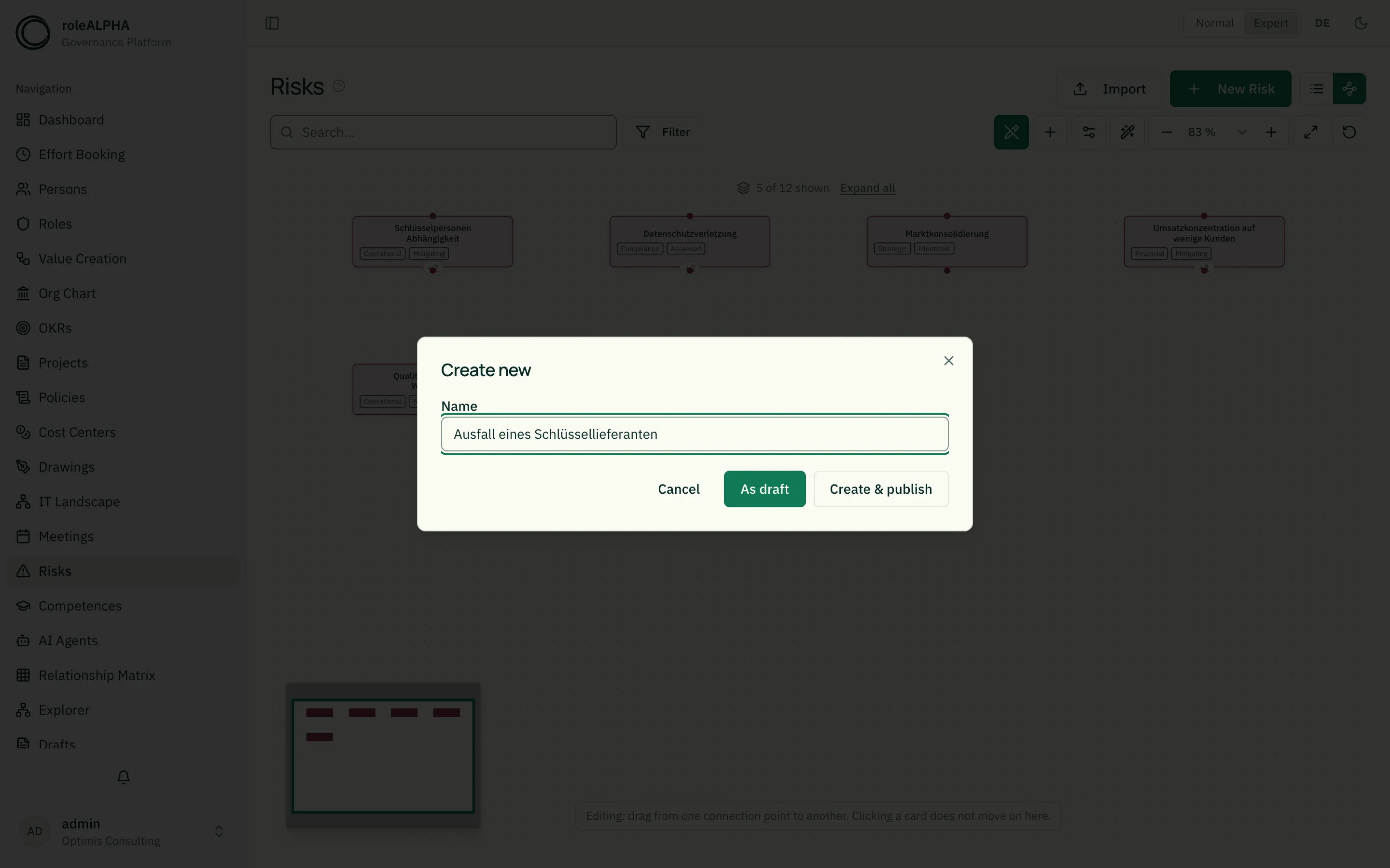
Only what you have the permission for is offered. If there is nothing you have it for, the plus does not appear at all.
Drafts in the picture
Section titled “Drafts in the picture”What has not been decided yet stays invisible by default: the explorer shows the set. The show drafts switch under Settings brings the open drafts into the picture — your own and other people’s, as far as you are allowed to see them.
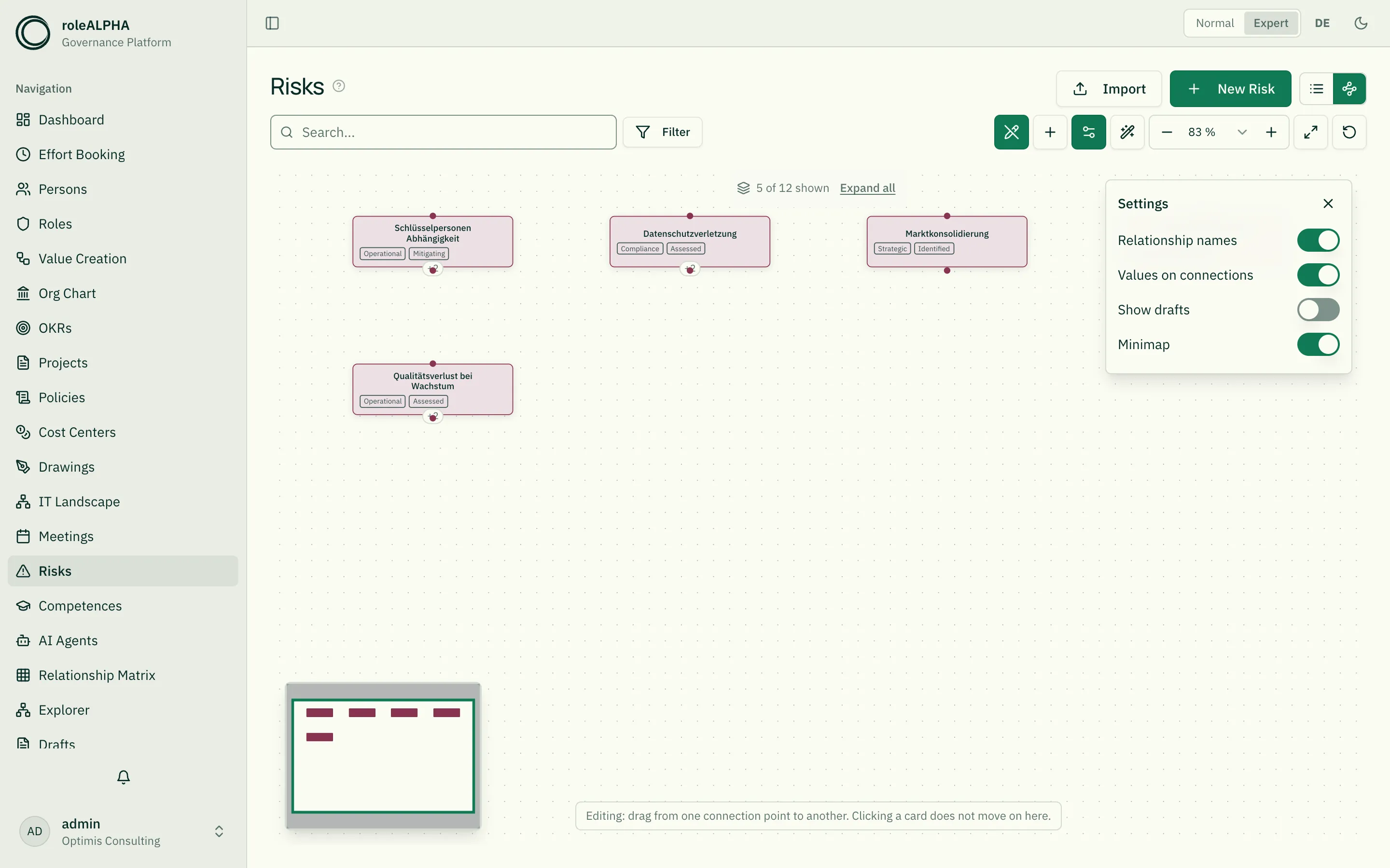
Four kinds of change are distinguished, each with its own sign:
| Sign | Meaning |
|---|---|
| Green dashed line | This relationship is to be created |
| Red line | This relationship is to be removed |
| Green-outlined card | This entity is to be created — it does not exist yet |
| Red, semi-transparent card | This entity is to be removed |
| Amber-outlined card | A change is planned for this entity |
The legend above the picture explains each of these signs while the switch is on.
Two things that deliberately do not happen:
- A planned relationship only appears when both ends are in the picture. Otherwise it would be a line into nowhere.
- A planned entity that hangs off nothing only appears where it belongs — in the picture of its own area. Otherwise the switch would drag every planned person into the risk view. If a planned relationship hangs off it, it comes along everywhere.
You cannot attach anything to a draft node. The entity behind it does not exist yet; a drag onto it says so rather than promising a connection no service would know. Publish it first.
The switch is remembered and applies everywhere — on the graph page, in every area and in the neighbourhood graph of a detail page. Switched off it costs nothing: drafts are then not even requested.
If very many drafts are open, the picture does not show all of them. How many there are in total is then stated right below the switch (“Showing 500 of 812 drafts”).
Working inside a scenario
Section titled “Working inside a scenario”Above the picture you can pick a scenario. While one is active, everything you change here — drawing, moving and deleting relationships — becomes a draft of that scenario instead of a change to the real state. At the same time the scenario is laid over the picture: you see what it would change. “No scenario” switches both off again.
Only scenarios that still accept drafts are offered; published and discarded ones are not listed. Creating and managing scenarios stays on the drafts page.
Selecting a node and moving on — in the 2D graph
Section titled “Selecting a node and moving on — in the 2D graph”The following gestures belong to the 2D view, not to the explorer: clicking a node highlights it; double-clicking sets the focus — the graph then shows only that node’s surroundings, within an adjustable number of steps. Holding Alt while clicking goes straight to the detail page; holding Shift links two nodes into a new relationship (see [[relationships-basics|Understanding relationships]]).
When the graph gets large
Section titled “When the graph gets large”From roughly 500 nodes the view says so and switches to a leaner rendering: no animation, no textures, no arrowheads, labels only on hover. For specific questions the focus function is the better route than loading the whole tenant at once.
Related
Section titled “Related”- Minimap – Stay Oriented in Large Diagrams — overview and zoom level in large diagrams
- Understanding Relationships — what a relationship is